Jen Mussari’s Killer Lettering
The making of the terrifying Robtober 2020 logo
Every October, I make a schedule of dozens of horror films, focusing mostly on ones I haven’t seen before. I call it Robtober, only half-ashamedly. It’s fun! For the past few years, I’ve announced the schedule’s contents via blog posts with increasingly elaborate designs, effectively dressing my site up for Halloween. This year, I wanted to harness some of my favorite visual themes from horror movie marketing (such as posters and trailers), and distorted hand-lettering tends to be a big part of that. So I called up my pal Jen Mussari.
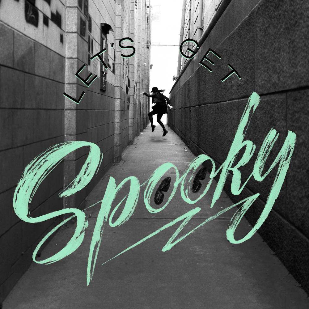
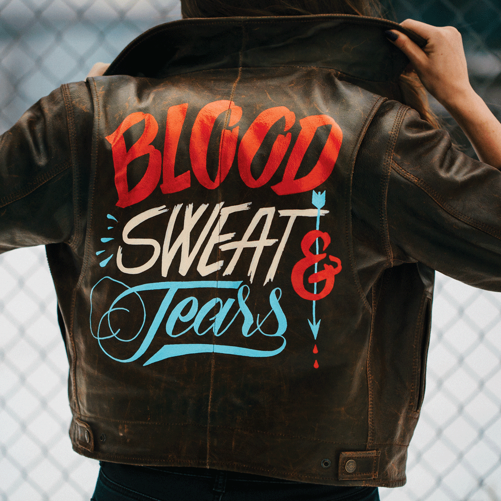
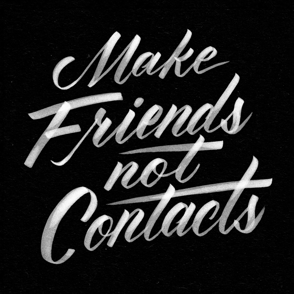
I was lucky enough to regularly marvel at Jen’s skill with handmade letterforms when we shared a studio space in Brooklyn years ago. Her work runs the gamut from turbulent to elegant, rough to refined, organic to geometric, and it’s always defiantly bespoke and human, so I was confident she could hit the sweet spot I envisioned for Robtober 2020. There are unconfirmed reports that when she enthusiastically agreed to do it, I gave myself a forceful high five.
We began by looking at some existing examples of horror movie lettering. Amazing lettering spans the history of film, but, prompted in part by an excellent group of horror logos collected by designer Christian Annyas, much of what I had in mind this time came from the 1980s. Here are the notes I gave Jen about what drew me to each example.
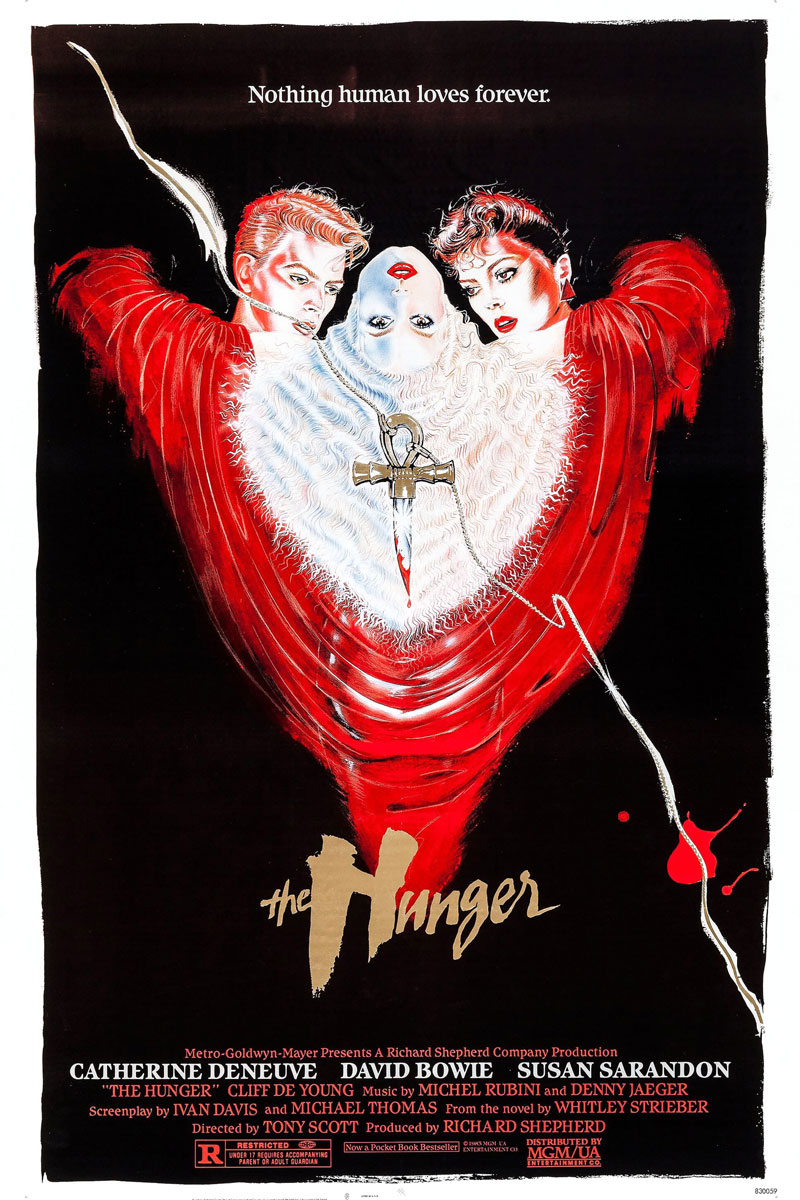
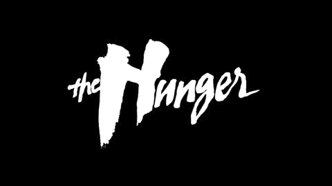
The Hunger: Maybe my favorite overall. The size contrast between “the” and “Hunger” and between the H and everything else. And the slight slope of the baseline upward to the right gives it a nice kinetic feel.
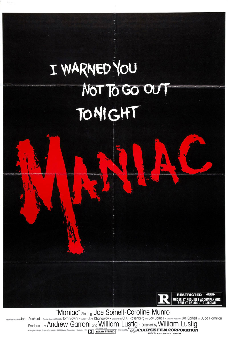
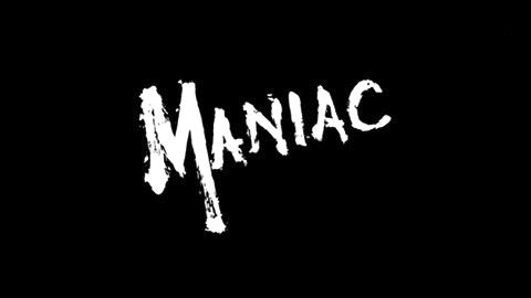
Maniac: Mostly the dry brush feel. The violence of it is perfect for Maniac, but I’m looking for something less literally bloody.
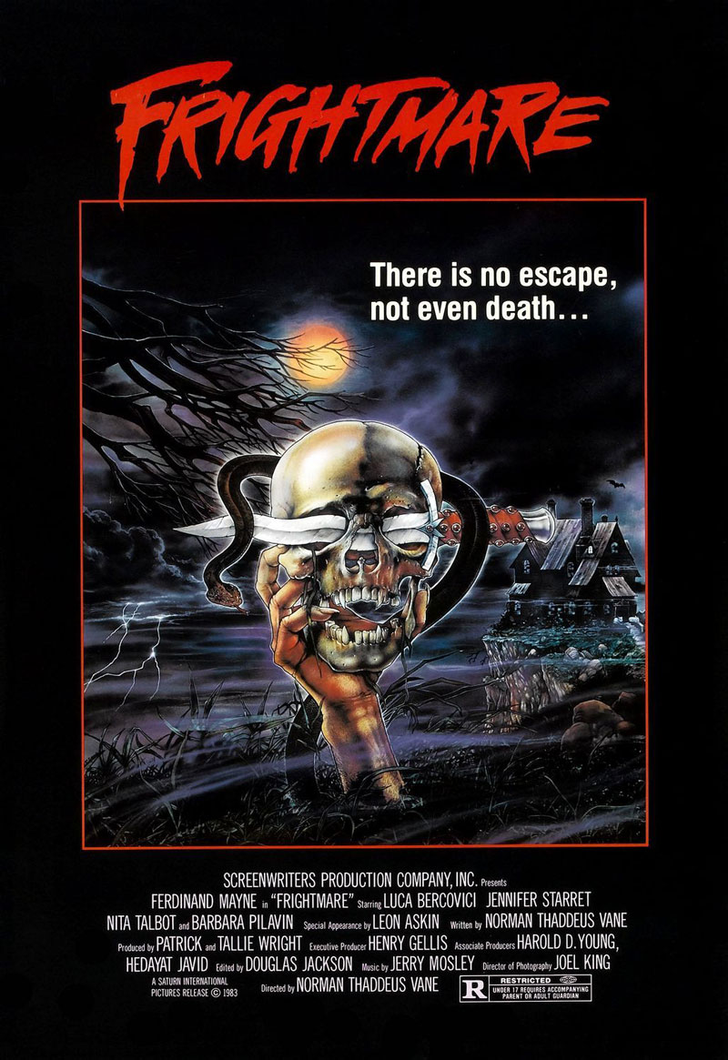
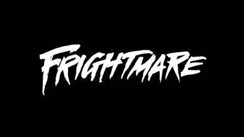
Frightmare: This is probably the closest to what I had in my head when I first started thinking about what I wanted Robtober to look like this year. I love the sharpness of the terminals and the oblique angle driving it forward. That said, it’s perhaps the most generic of the bunch, so we might not want to lean too hard in this specific direction.

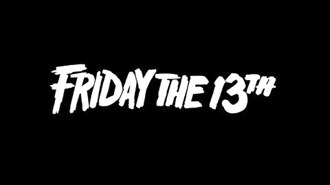
Friday the 13th: I like the bluntness of it. It bludgeons more than it stabs. It feels like it could have been scrawled out by the mentally and emotionally stunted Jason Voorhees, without sacrificing a certain cleanness and legibility.

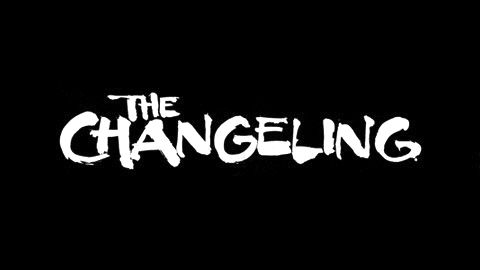
The Changeling: Mostly I like the stroke contrast and rough edges of this one.
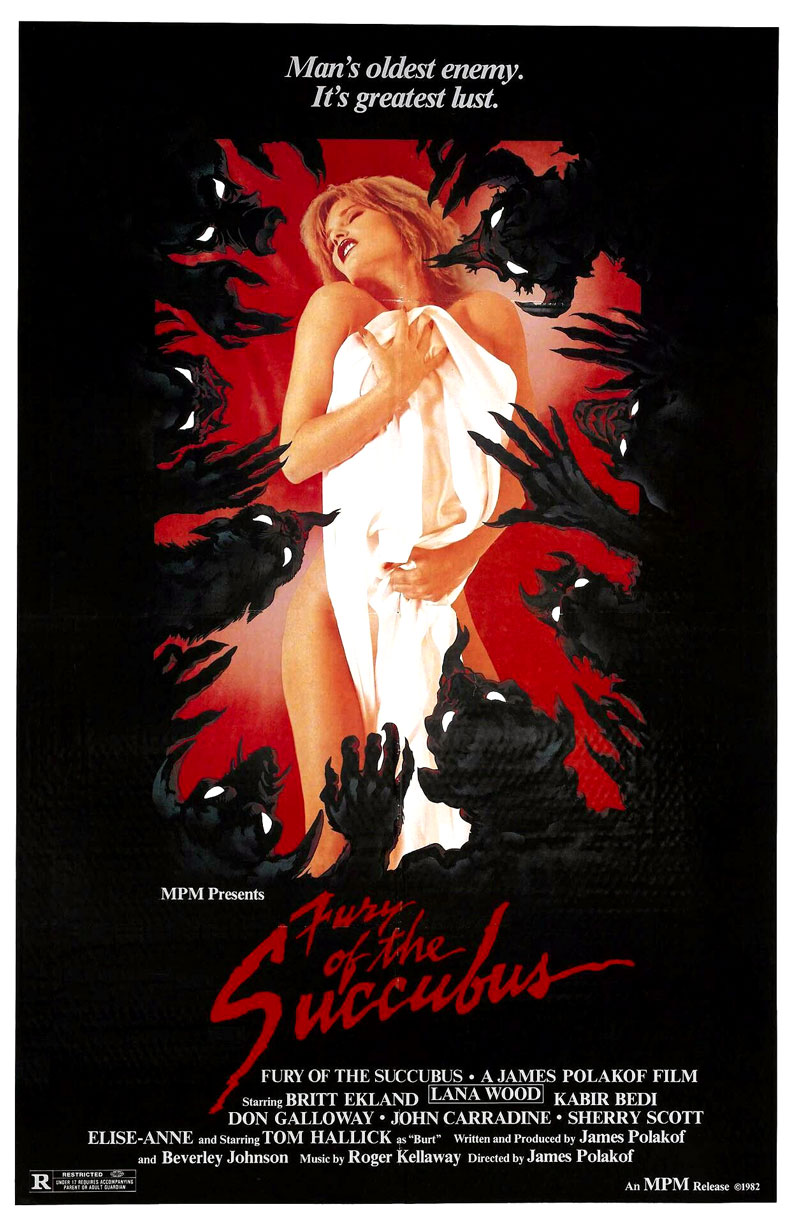

Fury of the Succubus: Maybe a touch more elegant than I’m going for, but I’m a little curious if a script approach could work. As with The Hunger, I love the upward slope of it.
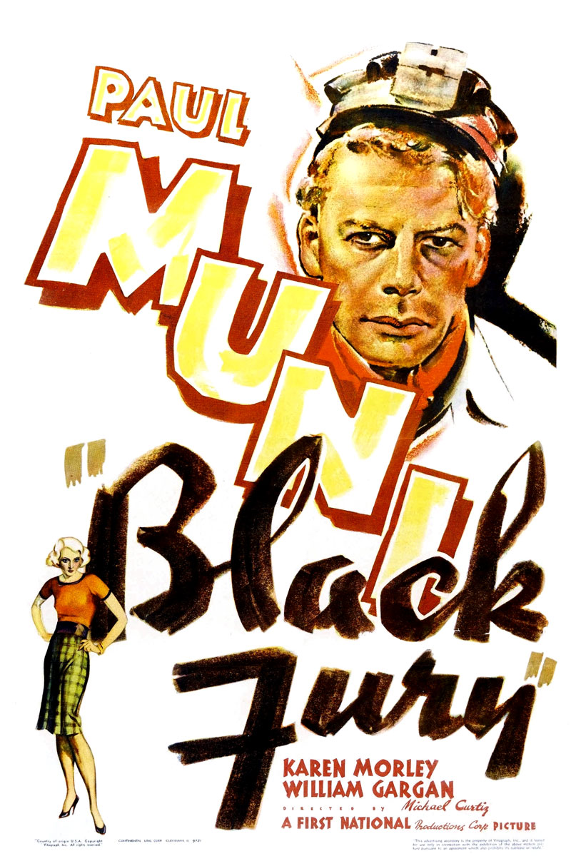
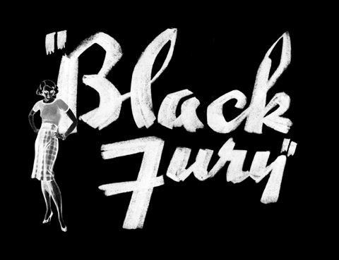
Black Fury: Not a horror movie, and I’m less interested in the letterforms’ shape than their texture. I guess this was done with charcoal or a conté crayon or something, but if we could get the ink wash equivalent of that, I think it could be pretty cool.
Armed with those examples and notes, Jen began working her magic, and the first set of concepts was very promising, taking cues from the straightforwardly scary styles of Frightmare and Friday the 13th, as well as the more script-oriented approaches of The Hunger, Fury of the Succubus, and Black Fury.

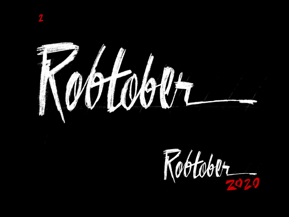
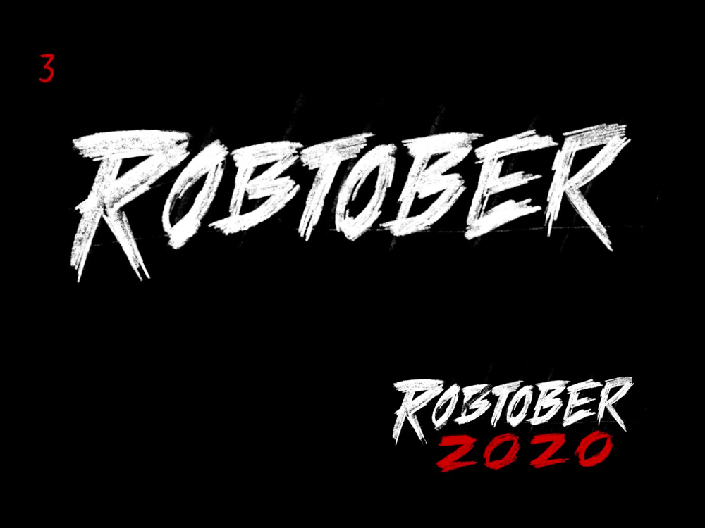
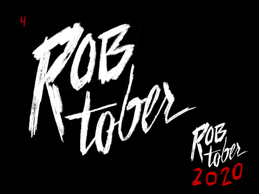
Of the initial rough concepts, 3 is my favorite. It has a violence about it that feels appropriate, but also, the other concepts don’t really look scary. Part of what makes 3 scary is its fairly generic horror vibe, and I had mixed feelings about that. I wanted the final product to be distinctive, but given that it was meant to participate in a fairly specific tradition, I wasn’t necessarily trying to transcend cliché.
As for the other concepts, 1 is in the same neighborhood as 3, but it feels too sleek. And I love the script direction that 2 and 4 hint at, which has a vampiric flavor, but overall the first set of concepts made me realize that what I really wanted was a slasher feel, which 3 comes closest to. I also really like the scrawled quality of “2020” in concepts 2 and 4.
Jen took my feedback and pushed the next set of concepts further into the darkness.
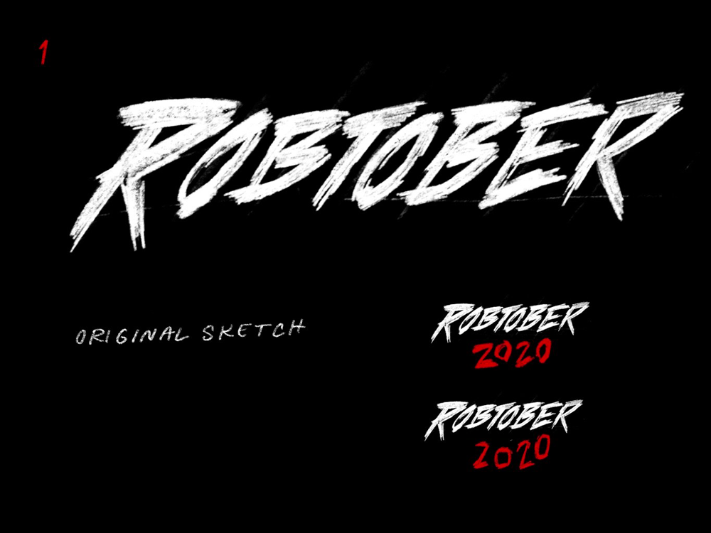
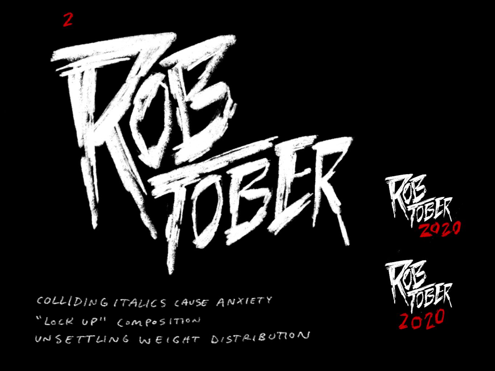
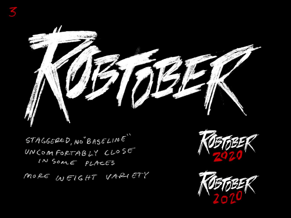
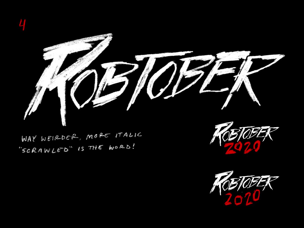
We were getting closer! I really like the composition of 2, but the intentionality of its lockup seems somewhat at odds with its scratchy, impulsive texture. I wondered how it might work with a more liquid look, à la The Hunger. 4 is moving in an intriguingly deranged direction, but still feels too consistent and competent to convince me that its creator ought to be institutionalized.
3, however, is easily the closest to being good to go. As Jen noted, its uneven baseline, tight letterspacing, and varied stroke weights contribute to its tense character. It has the right kind of controlled chaos, and it radiates a certain malevolence mixed with a bit of fun rock and roll energy. It’s the kind of thing I would have seen on a VHS box at West Coast Video as a kid and anticipated—with both terror and delight—the day I could sneak it past my parents. As far as I was concerned, 3 was ready to move toward the final stage.
At this point, Jen moved away from digital sketches and into physical ink washes, which would take us into more exciting and unpredictable territory.
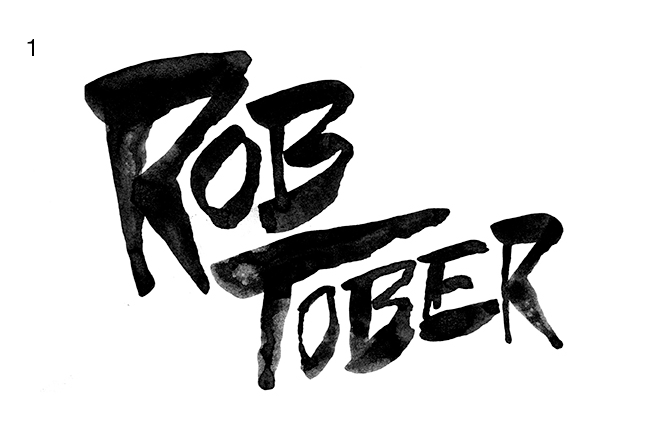
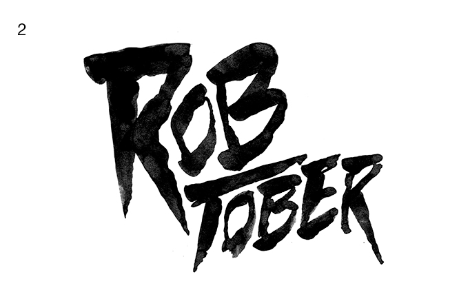
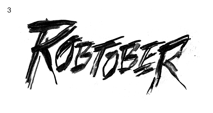
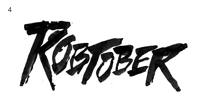
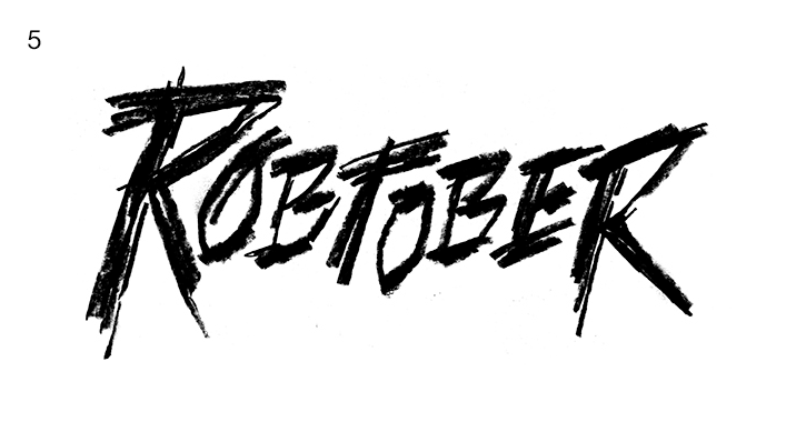
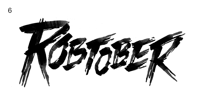
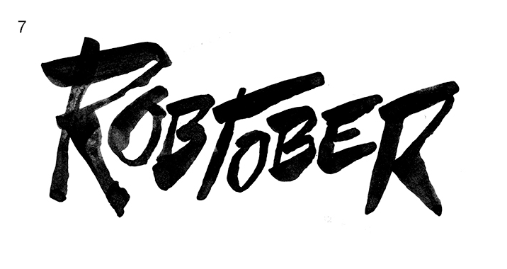
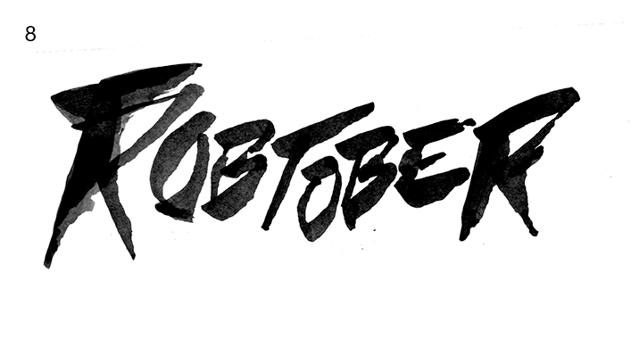
As requested, Jen did some more liquid versions of the lockup from the previous round (1 and 2). They had potential, but I was getting more of a spooky ghost story vibe from them than the more visceral, grisly feel of a slasher film.
For the remaining concepts, it was exciting to see such a variety of outcomes derived from the same basic shape. Some are wet, some are dry, some are agitated, and some are more subdued. I like them all, but 6 is the clear favorite. It somehow manages to be both jagged and fluid in a way that appears natural. That said, it still feels a little contrived, like multiple strokes were required to get its splintered terminals. But with a little bit of cleanup, we’d be at the finish line, and Jen was on the case.
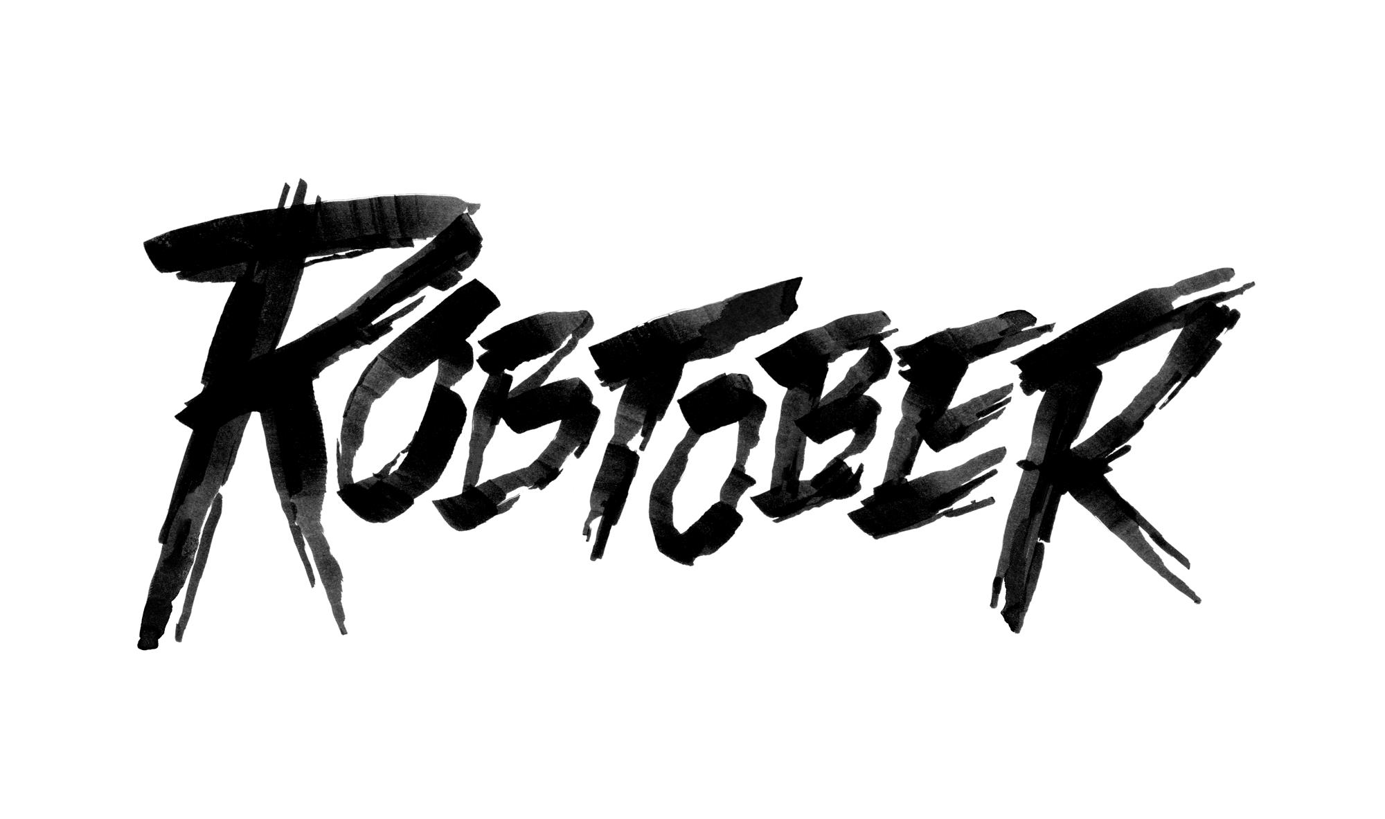
Boom! The final logo had arrived and I couldn’t be happier with it. It looks evil and fun, which is what all things should be, and I love the extra tactility and urgency the texture gives it. In conjunction with the rest of the layout, it looks like a real horror movie—maybe one from the ’80s that was a little too prescient about what was to come in 2020.
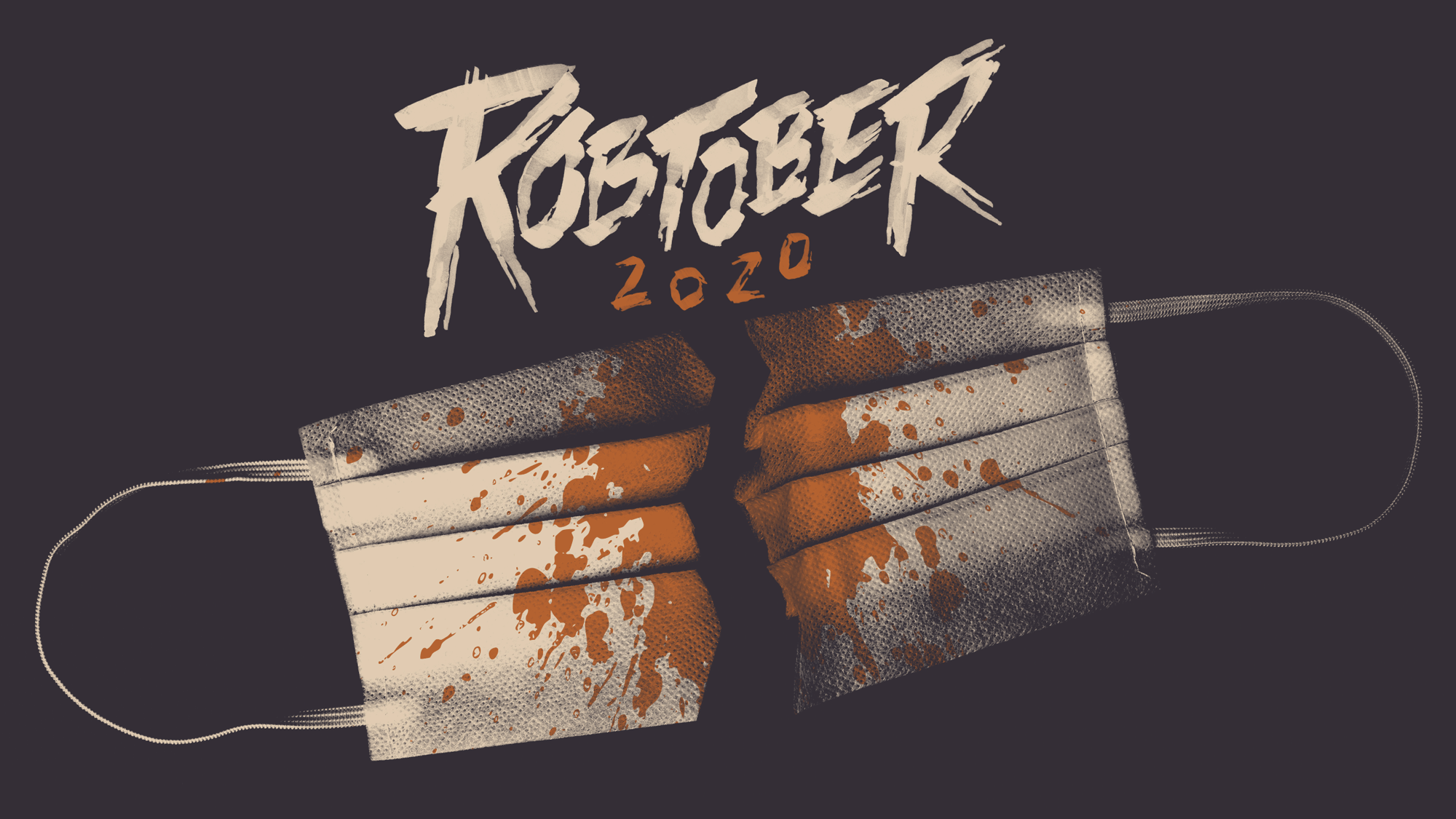
Working with Jen on this little passion project was just as much fun as I knew it would be. She really knows what she’s doing. If you ever have the chance to employ her skills, I highly recommend it!