Martha Groome: Simple and Not
For awhile now, I’ve been speaking to a career coach who also happens to be a veteran art educator, and she’s been a great help as I shift my focus from design to art. One thing she’s been asking me from the beginning is why. I’ve spent a lot of time thinking and writing about what I want to do and what I appreciate in the work of others, but why is a more fundamental question that can provide a greater clarity of purpose. It’s also a lot harder to answer.
The current Martha Groome exhibition (closing soon) at Larry Becker Contemporary Art here in Philadelphia gave me a good chance to ask the question, especially since Groome’s signature style aligns with the sort of minimalism that makes a lot of modern art skeptics roll their eyes.
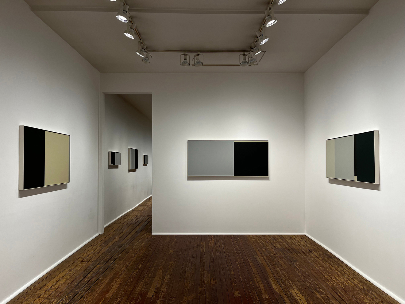
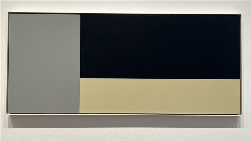
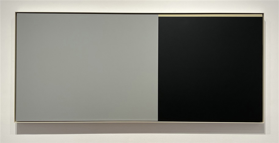
At a glance, Groome’s paintings are simple compositions dominated by black and white rectangles, but so much more emerges on closer inspection. For one thing, those blacks and whites are never merely black and white. A single black rectangle may be revealed to be two rectangles, one of which is actually a cosmically dark blue whose tone differs so slightly from its darker neighbor, you’ll wonder if it’s a hallucination. The whites and grays tend to quietly skew warm or cool, though that’s often obscured by their juxtapositions against pale yellows and blues. The sizes and placements of the components, which at first seem so rigid and rational, betray an arbitrary humanism when no underlying system can be discerned.
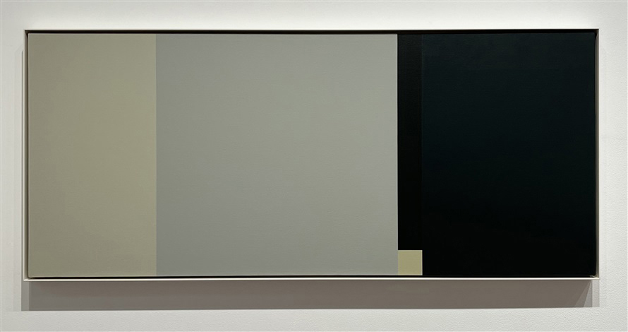
Parts to Play (2014)
I’ve often felt that to dwell too much on the “how” of a work’s production is to be distracted from the value of the result, but the meditative quality of these paintings invites the viewer to adopt the focused state of mind that brought them into being; to contemplate the time and concentration required to ascertain, mix, and evenly spread those very specific desaturated colors within their loosely intuited and sharply defined boundaries; Groome’s act of letting the rest of the world fall away for awhile so she could inhabit this little universe and come to understand it, simple and not, as she created it.
Simple and not: That may be the crux of the appeal for me.
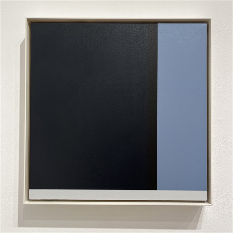
At Least One Other (2014)
Curiosity can feel like a curse. Life is a litany of complexities constantly overwhelming our understanding. It’s amorphous and always moving and we can’t get our arms around it all. “Everything is too much” is a common refrain in my head, setting off periodic waves of gloom, and I’ve noticed a pattern in my own work of paying attention to how visual forms grapple with this. In Plus Equals #2, I celebrate the halftone screen’s reduction of continuous tone to a binary:
I love halftones. Apart from the fact that they’re a brilliant innovation, which has yet to be substantially improved upon after over 150 years, I find them appealing both philosophically and aesthetically. Halftones remind us that a complex concept is sometimes best understood by placing it on a spectrum between two simpler, more fundamental concepts.
And in Plus Equals #4, I’m fascinated by isometric projection’s naive formal idealism:
And so goes the seduction with isometric projection: Its idealized geometry suggests an accessible codification of objective reality, a shortcut to a structural understanding of an otherwise chaotic universe; and yet its idiosyncratic visual language is just as ambiguous and falsifiable as any other, perhaps even more so. Isometric projection is a beautiful lie, and one for which I can’t bring myself to fault the liar.
Even my final bio on my abandoned Twitter account, quoting They Might Be Giants’ “See the Constellation,” hints at a desire to comprehend a complex organism in elemental terms:
Just a guy made of dots and lines
Whatever ideas they may represent to the artist or the viewer, Martha Groome’s rectangles, simple and not, embody an elemental comprehension without sacrificing nuance. Their orderly compositions and limited, neutral palette are simple and approachable, at least until you realize they’re neither orderly, nor limited, nor neutral, by which point those subtleties have become more intriguing than intimidating.

Listening to Stars (2010)
Seeing these contradictions harmoniously coexist is as comforting as it is challenging. In those moments when everything is too much, these paintings can remind me that understanding isn’t a zero sum game, that it’s possible to reduce a problem to manageable contours without ignoring its finer details, that merely acknowledging those finer details can be a sufficient substitute for actually making sense of them. We don’t have to know it all, and knowing how much we don’t know is its own kind of knowledge and can bring its own kind of peace.
This isn’t necessarily an earth-shaking epiphany, but it feels significant to me as a useful articulation of the kind of involute clarity I may be reaching for in my own work.
Groome had her own way of beautifully articulating what she was up to, and I’ll leave you with her images and words:
I ask how it is, why it is, what it is, about everything, all the time—except when I am dumbstruck by an unexpected meeting with whatever beauty is.
Some Grays (2010)
My painting is a bare quiet uncluttered form of abstraction, incidental geometry, thoughts made temporarily real, something near-nothing made to be encountered and considered.

A Different Stripe (2008)
I am influenced by anything in the world outside myself—whale songs, celestial events, space in a room, the heavy presence of the rocks in the woods down the road, the paintings of Matisse, the piles of dirt and mirrors of Robert Smithson, the choosings and placings of Ufan Lee…
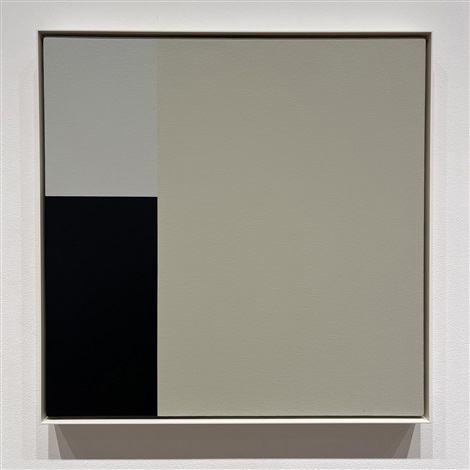
Or What (2014)
I am always trying to put my finger on what is ultimately immeasurable and unnameable.

Black Box (2019)
My painting is made to be simple easy direct, a sensation of presence with no instructions.
A Square Measured Off (2014)
I still see objects and situations which are encountered every day in terms of that moment before recognition and categorization.

Either Way (2012)
Over time, I have reduced the number of elements of painting that I use to only a few because a few are enough. Now, instead of drawing, I measure off areas of nothing on a square or a rectangle and then paint in and around them until they are something. The parts are like carefully chosen words.
—Martha Groome, 1945–2022