V6: Typography and Proportions
The logic behind the layout.
Once I solidified my V6 redesign’s reason for being and wrestled its content into some semblance of order, it was time to create a system to govern its appearance. The site consists almost entirely of things to read, so typography would be the core of that system. Tasked with satisfying the site’s various functional requirements as well as establishing visual character, it would be a necessarily multifaceted typographic core. So where to begin?
The typographic scale
If you’re a big believer in the essential virtue of unlimited choice, try to estimate how many hours of your life you’ve spent browsing Netflix. Constraints may intuitively seem oppressive, but shapes are defined by boundaries, and that’s what using a scale in a creative process is all about.
According to the OED, a scale is “a graduated range of values forming a standard system for measuring or grading something.” A piece of music using a particular scale—a limited selection of notes with a shared mathematic relationship—can effect a certain emotional tenor. Want to write a sad song? Use a minor scale. Changed your mind? Switch to a major scale and suddenly that same song is in a much better mood.
Spatial relationships can likewise achieve a certain visual harmony using similar principles, and the constraints a scale provides take a lot of the arbitrary guesswork out of the process of arranging elements in space. Most of what I design that incorporates type has a typographic scale as its foundation, which informs the typeface choices and layout proportions. The process of creating that scale begins by asking what the type needs to do, and what role contrasting sizes will play in that.
For V6, the availability of 15 years’ worth of content gave me the rare luxury of observing a mature set of publishing patterns, which made this largely an issue of finding new solutions to old problems. But there were new problems to solve, too: these publishing patterns are constantly evolving, and being able to see their trajectory could help me make educated guesses about what new patterns might emerge in the future. For example, over time I’ve used images more often and in a wider variety of ways, so captions would be an important consideration. Same thing for data-oriented projects and tables. How should these different methods of packaging textual information fit into a larger system?
On the UI side of things, the structure of V6’s central archive gave me a conceptual framework to consider the interactive qualities of the type. How best to standardize the site’s various methods of navigation? What is their hierarchy?
After taking inventory of pretty much every species of text I could expect to appear on the site, I was able to boil it all down to a handful of classifications. In rough order of prevalence:
- body text
- metadata
- captions
- mid-level headings
- labels
- top-level headings
- low-level headings
The contents of the list aren’t unorthodox or surprising, but it’s worth taking a step back once in awhile to really scrutinize the things we take for granted. In this case, it might not have otherwise occurred to me that the vast majority of the text on the site could be set in just two sizes, with two additional sizes to be used sparingly for special emphasis. My hierarchical scale’s four positions, in ascending order of size:
- Captions, asides, metadata, labels
- Body text, low-level headings
- Mid-level headings
- Top-level headings
As for what those sizes would actually be, they needed to have some kind of consistent relationship to qualify as a “graduated range.” In honor of the site’s 15th anniversary this year, I chose an interval of 1.5, so each size on the scale would be 1.5 times bigger than the one before it. If, for example, I wanted my body text to be 18px, the scale would look like this:

My typograhic scale (not shown, uh, to scale).
12px(18 ÷ 1.5)18px(base size, body text)27px(18 × 1.5)40.5px(27 × 1.5)
Now, those pixel values are all well and good, but designing for the web is all about flexibility. If at any point I decided I wanted to change the scale’s defining interval or base size, I’d have to recalculate all the values. That’s what computers are for. So I built my scale in rem units using Sass variables. Here’s how the four sizes in the above list map to those variables, powered by an $interval variable that will also be useful later:
$interval: 1.5;

$scale0:   1rem;                 // 18px (base size, body text)
$scale-1:  $scale0 / $interval;  // 12px
$scale1:   $scale0 * $interval;  // 27px
$scale2:   $scale1 * $interval;  // 40.5px
In this system, giving $scale0 a value of 1rem makes the entire scale relative to the font-size of the root html element. Most browsers default to 16px, so in order to bump that up to 18px (letting Sass do the math for me once again):
html {
  font-size: percentage(18/16);
}
From here, any font-size declaration using one of those four $scale variables will align with the scale, and if needed, I can easily make site-wide adjustments with small tweaks. Powerful stuff!
The typefaces
Having the scale in place gave me a framework for the next step: evaluating prospective typefaces. Typeface selection and pairing are more art than science, and a nebulous art at that. Many designers have documented their methods, and their successes speak for themselves, but I’ve never found a formula that consistently works for me, and the journey is different every time. For this project, I noticed that most of the text on the site falls pretty neatly on one side or the other of a simple dichotomy: It’s either offering structural, navigational assistance (metadata, labels, headings), or it’s speaking more expressively in my voice (body text). So I decided typeface selection and pairing would be guided by that contrast, expressed as a simple and thematically appropriate concept: left brain, right brain.
Right brain: Freight Text
I’ve been a fan of Joshua Darden’s Freight family since it was introduced over a decade ago, and Freight Text has been my choice for V6’s body text from the design’s earliest iterations. Freight Text is a polished and carefully proportioned transitional serif with a robust character set. Its usage is reserved exclusively for when I’m speaking directly to the reader, and its looks reflect my ambitions for my writing: honed for precise and clear communication, but still the work of a particular set of human hands. Importantly, it also has a dash of idiosyncratic flair, best exemplified by its pronounced ball terminals and its italic’s unexpected chamfers.

Freight Text Book.
Left brain: Ciutadella
I spent many hours digging through hundreds of geometric sans-serif faces, looking for one with a legibility befitting scannable lists of metadata (the site’s organizing navigational principle: topics, sources, dates), and a shape and proportions that would be a more mechanical complement to those of its coworker-to-be, Freight Text. It needed to look good at large sizes (headings) and be readable at tiny sizes (captions), I wanted it to be a smidge condensed so big headings wouldn’t wrap too aggressively on small screens, and it would have to work well for medium-length passages of text, too, since it would be handling block quotes. It was a lot to ask, but Eduardo Manso’s Ciutadella rose to the challenge with its rigid geometry and smart stylistic alternates.

Ciutadella Regular. Note the alternate lowercase t (with the curved stroke, on the second line) and lowercase a (the double-story version on the third line), which are used for increased legibility at small sizes.
The column structure

A print layout’s fixed dimensions allow for a carefully-prescribed visual harmony. This spread’s foundation is a three-root rectangle.
Scale? Check. Typefaces? Check. Now they would need a layout to live in.
In a more static context like a printed page, the typographic scale and layout could be arranged to harmonize with known page dimensions, or vice versa. Designing for the web, of course, is more complicated. Generally speaking, in web design, the dimensions of the viewport and the height of the content are unpredictable, which introduces a crossroads: Should the page layout be in proportion with the fixed size of the type (adaptive) or the fluid size of the viewport (responsive)?
- The adaptive approach’s fixed layout offers the assurance that lines of text are exactly as long as desired (45–75 characters is considered optimal for readability) and that layout proportions can adhere to the same scale as the type, so the page layout and the type are speaking the same language. However, the fixed page layout and the fluid viewport size will not be speaking the same language. It’s easy enough to use media queries to ensure that the page is never wider than the viewport, but the page’s horizontal margin widths will still be at the mercy of the viewport width, making it impossible for them to have a spatial relationship with the type.
- With the responsive approach, the inverse is true. The fluid page layout will be proportionate to the viewport, but not the type.

An adaptive layout’s proportions are fixed, relative to the content.

A responsive layout’s proportions are fluid, relative to the viewport.
I usually prefer the responsive approach. When it’s done right, it can make the page feel entirely at home on virtually any viewport, whereas even the best adaptive designs tend to feel at least a little bit retrofitted. Attentive em-based media queries can make sure line lengths stay well within the 45–75-character ideal, and while the proportions of the fluid layout can’t fall perfectly in line with those of the fixed type1, they can have a relationship by using the same scale. Here’s how I applied the scale I devised above to the column structure (note that these are unitless values since they represent flexible proportions rather than fixed sizes):
- Padding width: 12
- Gutter width: 27
- Column width: 40.5
- Margin width: 40.5
How many columns?

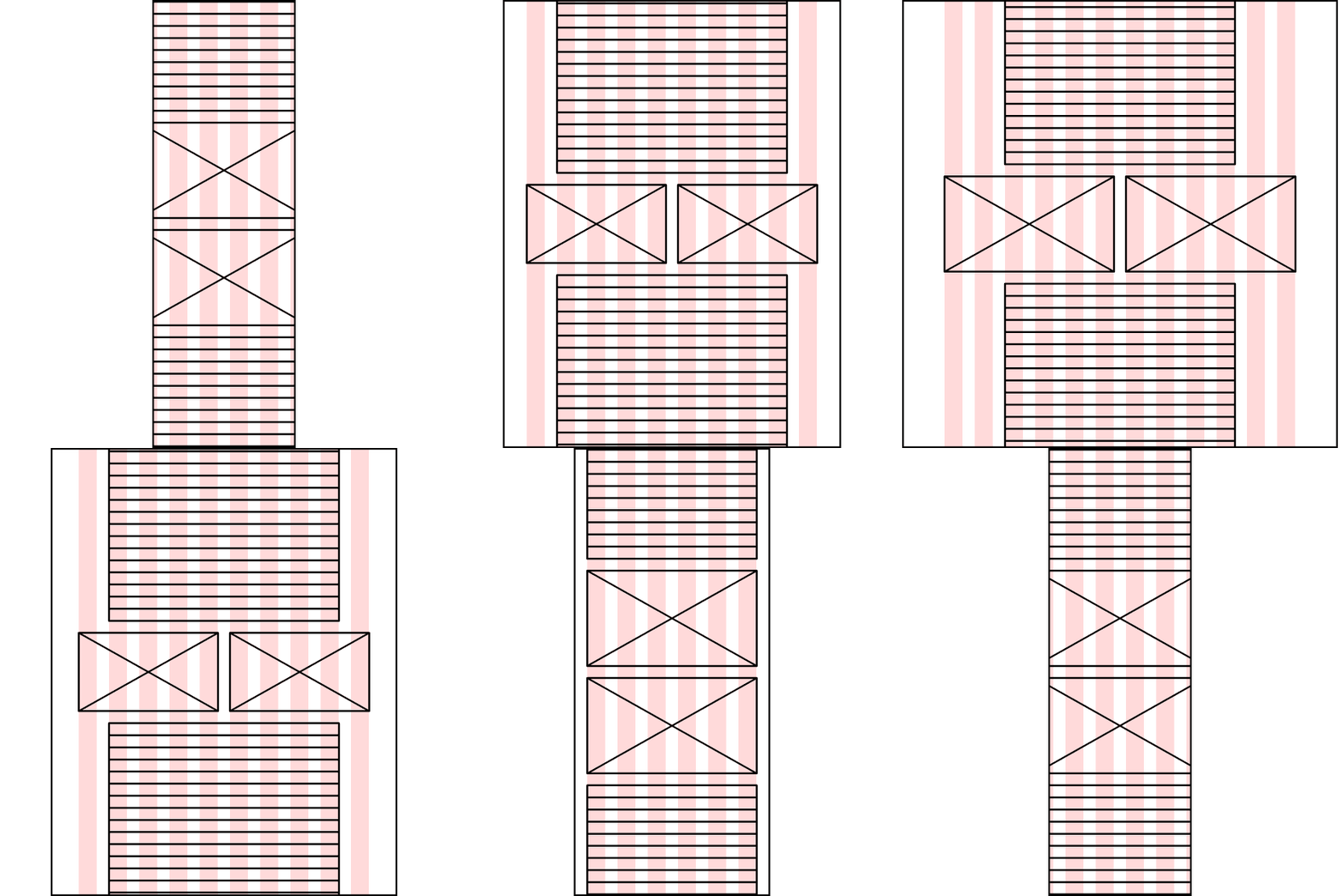
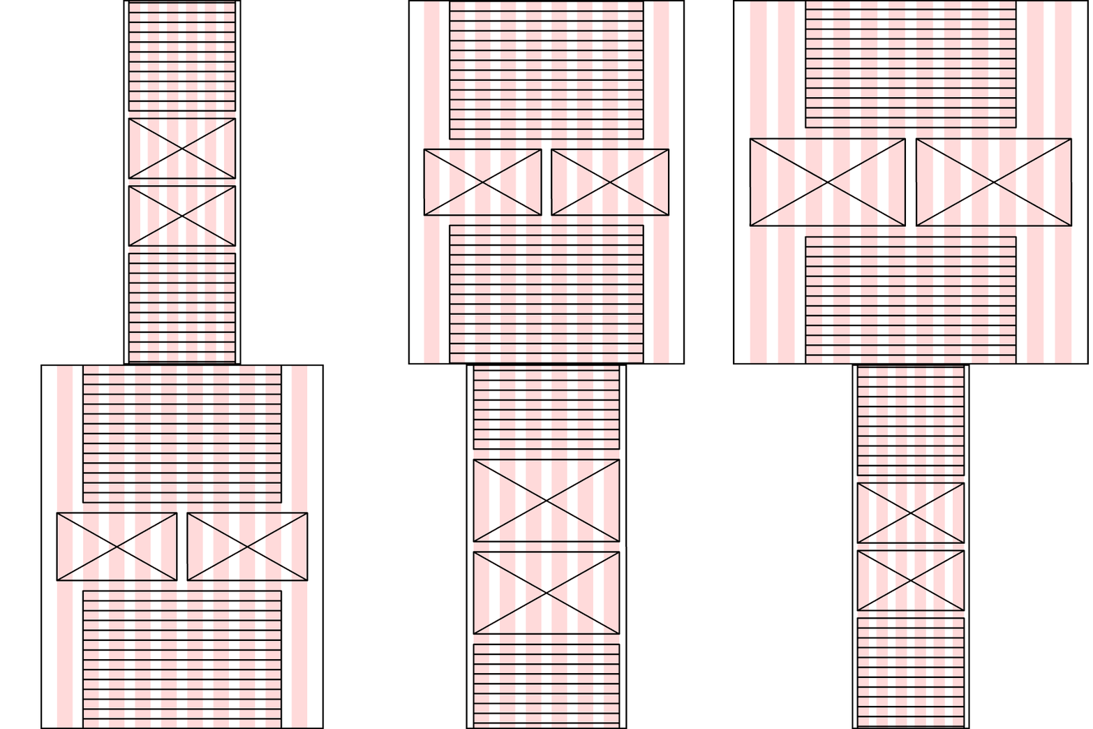
The various layout options for figures and asides within the widest breakpoint’s 12-column structure, hingeing on the 8-column text block in the center.
The proportions listed above weren’t determined in a vacuum. The content is the arbiter of the layout, so its needs inform the number of columns at various viewport sizes, which in turn inform the proportions of those columns. In this case, the narrowest layout has six columns, mostly for the sake of the Blog Archive page, whose lists at that size bisect and trisect the page. As the viewport expands, columns are added but used sparingly—the main content area maxes out at eight columns (to keep the line length in check), and the additional outside columns widen the margins and offer a variety of options for placing supporting content like figures and asides. My column counts per breakpoint:
- 6 columns (extra-small viewports, 0–35em wide)
- 8 columns (small viewports, 35–45em wide)
- 10 columns (medium viewports, 45–60em wide)
- 12 columns (large viewports, 60em+ wide)
Implementation, the old way

Reference diagram for calculating percentage widths.
Building a layout with a rational column structure used to be a laborious task. The first step was making a reference diagram that mapped out the widths of virtually every span that might occur within the column structure.
I would then use that diagram to calculate CSS percentage widths that aligned with the desired proportions. So if I wanted a four-column element inside a six-column element, I’d get the correct percentage by dividing the target width (four-column span, 243 wide) by the container width (six-column span, 378 wide):
.example {
  width: 64.285714285714286%; /* 243/378 */
}
This was a tedious process, and to make matters worse, if I wanted to experiment with different proportions, I’d have to do all the diagraming and math all over again. Once I started using Sass, though, I realized it could automate the process. Some existing libraries like Neat were already on the case, but none tackled the issue quite to my satisfaction, so I built my own tool.
Implementation, the new way: Column Setter
Column Setter is a Sass tool that lets you easily set up a custom column structure and build a layout that aligns to it. It uses just a few simple functions and mixins to generate percentage widths based on your settings. The column structure’s proportions listed above are easily added to Column Setter’s settings file like so:
$pad: 12;   // Padding width
$gut: 27;   // Gutter width
$col: 40.5; // Column width
$mar: 40.5; // Margin width
If I want to make these proportions more dynamic, their shared basis with the typographic scale lets me incorporate the $interval variable I established earlier:
$pad: 1;                            // 12
$gut: $pad * $interval * $interval; // 12 × 1.5 × 1.5 = 27
$col: $gut * $interval;             // 27 × 1.5 = 40.5
$mar: $col;                         // 40.5
The second half of the settings file lets me specify an unlimited number of breakpoints, customizing them by name, min-width, and number of columns:
$breakpoints: (
  xs:  (cols:  6, min:  0,   margin: $pad), // Includes optional custom margin
  sm:  (cols:  8, min: 35em, margin: $gut), // Includes optional custom margin
  md:  (cols: 10, min: 45em),
  lg:  (cols: 12, min: 60em)
);
Using the settings above and Column Setter’s colspan function and breakpoint-min mixin, this…
.example {
  @include breakpoint-min( lg ) { // At the 'lg' breakpoint,
    width: colspan( 4, 6 );       // make the width four columns out of six
  }
}
…will compile to this:
@media screen and (min-width: 60em) {
  .example {
    width: 64.285714285714286%;
  }
}
As with my typographic scale earlier, I can now alter my layout’s proportions significantly (or moderately, or slightly) just by changing a variable or two. Again, powerful stuff!
We used Column Setter on the recently revamped ProPublica site, and we’ll be open-sourcing it soon it is open source. If it sounds like it’s for you, give it a try!
Implementation, the newest way: CSS Grid
Column Setter is built for a float-based layout method that CSS Grid is already making a thing of the past. I haven’t delved too deeply into Grid just yet (I’ve recently begun a personal project to do just that), but if I had known how rapidly its browser support would grow this year, I probably would have used it on this redesign. Column Setter is still useful if it’s important for your site to have a sophisticated layout in older browsers, but CSS Grid is undeniably the future.
A living system
I’ve gone out of my way to make all the work described above be as malleable as possible, with small edits capable of making big changes. A template designer can only be so clairvoyant; eventually some bit of content will come along that your work is unprepared to accommodate. Tweaks will inevitably be necessary. Have a system in place that welcomes them.
It’s also worth mentioning that, while overfastidiousness would seem to be the provenance of systems thinking, sometimes you just have to eyeball it. After creating my typographic scale, I bumped up the smallest size an arbitrary amount, from 12px ($scale0/$interval) to 13.5px ($scale0/($interval/2)). It deviates from the scale’s interval, but it looks better. The system is the foundation, but it doesn’t have the final say—I do. It’s okay to go with your instincts and color outside the lines.
Speaking of color, that’s what the third and final post in this series will tackle. Stay tuned!
Footnote
-
There is an approach that’s arguably an adaptive/responsive hybrid, using viewport units (as seen on Mike Davidson’s site), but I have yet to really explore it. ↩︎