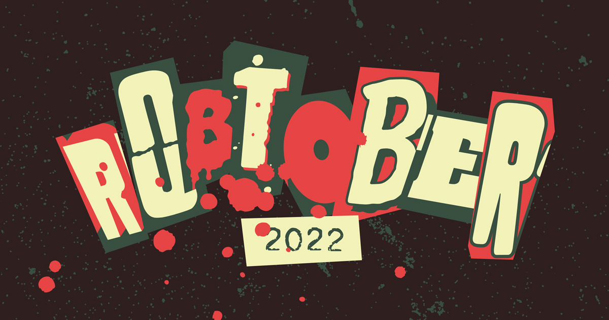
Robtober 2022 Design Notes
How to design a ransom note

Happy Halloween! Here are a few quick notes about this year’s design for Robtober, my annual horror movie marathon.
The ransom letters
The ransom note concept for the title screen came to me in the middle of the night, and I don’t remember if it was inspired by something specific. But in my subsequent research, I read the entire Wikipedia article about the murder of JonBenét Ramsey, so if that’s a knowledge hole your pub trivia team needs filled, hit me up.
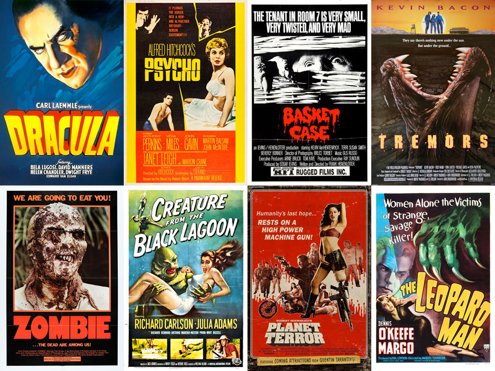
In lieu of emulating that particular ransom note, however, I decided mine would use letters from horror movie posters. Robtober is about movies I haven’t seen before, but since ransom notes are designed to obfuscate their author, I purposely chose posters from movies I have seen. Filtering my well-tended Letterboxd profile by genre/horror made finding the right posters a snap, and for the sake of variety, further filtering by decade ensured no two letters were from the same time period. The eight posters I sourced, in order of appearance, are Dracula (1931), Psycho (1960), Basket Case (1982), Tremors (1990), Zombie (1979), Creature from the Black Lagoon (1954), Planet Terror (2007), and The Leopard Man (1943):

Eight letters, eight horror movies, eight decades.
I issued a challenge on Twitter to see if anyone could identify all eight letters, and unsurprisingly, Nick Sherman nailed it.
The responsive title screen
I was happy with how the title screen turned out, but its horizontal orientation had a lot less impact when it was squished onto a mobile device’s vertical screen. So I rearranged the letters to make a vertical version, activated in the browser by a max-aspect-ratio media query.
I think this is the first time I’ve used an aspect-ratio media query and it certainly won’t be the last. When the viewport is taller than it is wide, each letter in the title, which is rendered in SVG, is translate’d to its alternate coordinates:
@media (max-aspect-ratio: 1/1) {
  #logo__r1 { transform: translate(57.23px, -92.64px) }
  #logo__o1 { transform: translate(58.76px, -77.82px) }
  #logo__b1 { transform: translate(61.68px, -47.67px) }
  #logo__t1 { transform: translate(20.47px, 3.44px) }
  #logo__o2 { transform: translate(-36.39px, 10.28px) }
  #logo__b2 { transform: translate(-45.56px, 54.79px) }
  #logo__e1 { transform: translate(-56.34px, 72.76px) }
  #logo__r2 { transform: translate(-57.82px, 82.35px) }
  #logo__2022 { transform: translate(-15.39px, 70.08px) }
}
The animation that got away
The title screen was also supposed to be animated, but I’m still all thumbs when it comes to Intersection Observer, which is necessary to trigger the animation at the appropriate time. I couldn’t get it working reliably across browsers in time for publication.
The sequence isn’t going to win any motion design awards, but it does give the title a more cinematic feel, and I especially like the blunt effect of the blood droplets at the end. Hopefully someday down the road I’ll come back to it and get it properly working, but until then, we’ll always have the video above. I didn’t change the code, but it seems to be working now!