A Modern Typographic Scale
I’ve been studying music theory this year. While some of its core concepts were already familiar to me, much of their specifics were not. Or so I thought. A funny thing happened when I was learning the major scales. While playing through a song I had written some years before, I started picking it apart to see how it correlated with the theory I was learning. I had composed the melody without any thought to what the specific notes were, but as I started to transcribe them, a pattern quickly emerged: all the B’s and E’s were flat and the rest of the notes were natural. Lo and behold, long before my music theory studies began, I had written a song in B♭ major. My ears already knew how the major scales worked even if my brain didn’t. (If you know how “do re mi fa so la ti do” is supposed to sound tonally, then your ears know, too.)
When music is composed to a scale, it sounds “right” to us. And just as our ears appreciate harmony and melody with a rational basis, our eyes can appreciate the same concepts applied to spatial relationships.
Have you ever struggled with sizing type in a design project, especially when you need more than just one or two sizes? Have you ever despaired at the number of ad-hoc type sizes on your site spiraling out of control over time? It could be that you’ve been composing the typographic equivalent of a cacophonous symphony. And the first thing any composer will tell you to do is to get that thing on a scale.
Meet the typographic scale
You don’t need to know music theory to work with a typographic scale. You only need to know that a scale is a range of values with an established mathematic relationship. For a typographic scale, that relationship is frequently a steady interval between type sizes. Depending on what you need your type to do, the interval might be fixed (e.g. each size is two pixels bigger than the size before it) or it might be proportional (e.g. each size is twice as big as the size before it). I personally rarely find fixed intervals useful, so I’ll be focusing on proportional intervals.
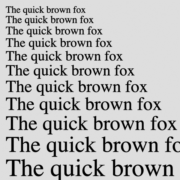
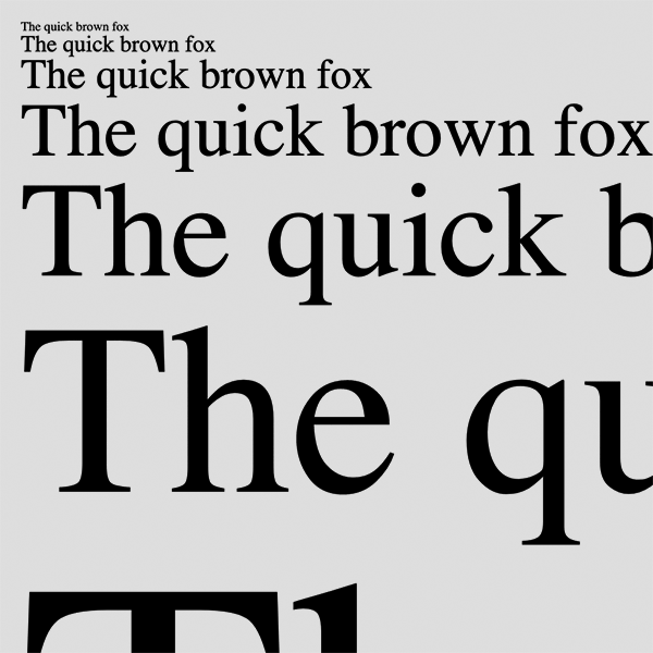
The most important thing to understand about proportional intervals is thankfully not complicated: The bigger the intervals are, the more drastic the size differences will be in your scale. If your layout calls for contrast, a bigger interval might be the way to go. If you’re aiming for something more nuanced, go smaller. But keep these things in mind:
- There is such a thing as too much nuance: if a size on your scale is virtually indistinguishable from the sizes adjacent to it, it defeats the purpose of using a scale.
- On the flip side, too much contrast renders the sizes’ proportional relationship moot. At a certain point, massive display type is arguably more graphic than textual.
- More is less. The more sizes you use, the less they’ll mean.

A small interval (1.1) offers a smoother range of sizes.

A large interval (1.8) offers more contrast.
Setting up the scale variables
The quickest way to get a scale up and running when working on the web is to drop its values into some CSS variables. The naming convention I typically use begins with --scale0, which is the body text size. The size below it is --scale-1 (as in “scale minus one”), the size above it is --scale1, and so on. Keeping the names relative to each other like this helps me move around the scale intuitively as I use it. If, say, --scale4 isn’t big enough for my h1, I can move up to --scale5 or --scale6, and I always know exactly how many steps away from the body text I am. Here’s a first pass at a simple set of scale variables using an interval of 1.5:
:root {
  --scale-2: 7.1px;  /* 10.7 ÷ 1.5 */
  --scale-1: 10.7px; /* 16 ÷ 1.5   */
  --scale0: 16px;    /* body text  */
  --scale1: 24px;    /* 16 × 1.5   */
  --scale2: 36px;    /* 24 × 1.5   */
}
I can use these variables with any CSS property that accepts a numeric value, like so:
p { font-size: var(--scale0); }Rooting around in rems
I’m off to a good start. However, those px values are a little too absolute for my liking. If I convert them to rems, it’ll give my scale more flexibility. rem stands for “root em.” 1rem is equivalent to the html element’s text size, which in most browsers defaults to 16px. Crucially, though, users can adjust that size in their browser settings, and using rems in my CSS will respect those preferences.
:root {
  --scale-2: 0.4rem;  /* 0.7rem ÷ 1.5 */
  --scale-1: 0.7rem;  /* 1rem ÷ 1.5   */
  --scale0: 1rem;     /* body text    */
  --scale1: 1.5rem;   /* 1rem × 1.5   */
  --scale2: 2.25rem;  /* 1.5rem × 1.5 */
}
Another benefit of the relative nature of rems: I tend to use larger text sizes on large viewports and smaller text sizes on small viewports. Rather than adjusting dozens or hundreds of typographic CSS declarations per breakpoint, I can shift the whole scale up or down merely by adjusting the font-size on the html element:
html { font-size: 100%; }     /* 1rem = 16px */

@media screen and (min-width: 25em) {
  html { font-size: 112.5%; } /* 1rem = 18px */
}
Calculating with calc()
My scale is coming along. Its variables’ intuitive names make it easy for me to use, and its rem values respect the user’s browser preferences and allow me to easily shift the size of the entire scale at different viewport sizes. But my setup still isn’t optimized for one very important adjustment: the interval, which is currently 1.5. If 1.5 isn’t quite working for me and I want to see how an increase or decrease will affect the scale, I need to do the math all over again for every step in the scale every time I adjust the interval. The bigger the scale, the more time that will take. It’s time to put down the abacus and get calc() involved.
:root {
  --int: 1.5;
  --scale0: 1rem;
  --scale-1: calc(var(--scale0) / var(--int));
  --scale-2: calc(var(--scale-1) / var(--int));
  --scale1: calc(var(--scale0) * var(--int));
  --scale2: calc(var(--scale1) * var(--int));
}
My interval now has its very own variable, called --int. calc() determines each scale size by multiplying the preceding size by --int. Now that every size is ultimately dependent on --scale0’s value, --scale0 must appear first in the list. Since the sizes smaller than --scale0 are going down rather than up, their values require division rather than multiplication.
Scaling the scale
I can now quickly and easily tweak my scale’s interval by adjusting --int until the proportions are just right, but if I want to add more sizes to the scale, I need to add more variables and calc() values. This isn’t too big of a deal, but if I want to double or triple the number of sizes, it’s kind of a headache. Luckily, this is the sort of thing Sass is really good at. In the following code, adjusting the first four Sass variables at the top of :root will quickly spin up a set of CSS variables like the scale above, with any interval (proportional or fixed) and any number of scale sizes:
:root {
  $interval: 1.5;    // Unitless for proportional, unit for fixed
  $body-text: 1rem;  // Must have a unit
  $scale-min: -2;    // Unitless negative integer
  $scale-max: 2;     // Unitless positive integer

  --int: #{$interval};
  --scale0: #{$body-text};

  @if $scale-min < 0 {
  // Generate scale variables smaller than the base text size
    @for $i from -1 through $scale-min {
      @if type-of($interval) == number {
        @if unitless($interval) {
          --scale#{$i}: calc(var(--scale#{$i + 1}) / var(--int));
        } @else {
          --scale#{$i}: calc(var(--scale#{$i + 1}) - var(--int));
        }
      }
    }
  }
  @if $scale-max > 0 {
    // Generate scale variables larger than the base text size
    @for $i from 1 through $scale-max {
      @if type-of($interval) == number {
        @if unitless($interval) {
          --scale#{$i}: calc(var(--scale#{$i - 1}) * var(--int));
        } @else {
          --scale#{$i}: calc(var(--scale#{$i - 1}) + var(--int));
        }
      }
    }
  }
}
Go forth and scale
Typographic scales have been an indispensable part of my work for many years, and CSS variables and calc() make setup, adjustments, and experimentation easier than ever. I hope you find these techniques as useful as I do!