Generate New York 2018
My takeaways from two days of talks on all things web design.
The Generate conference made its annual visit to New York at the Metropolitan Pavilion in Chelsea from April 25–27. This was my second Generate, and unlike my first one (in 2014), it was a single track, which I much prefer.
Donna Lichaw: Story First: Crafting Products That Engage
Donna is the author of The User’s Journey: Storymapping Products That People Love. She applies her experience as a filmmaker to helping people take a narrative approach to developing their products and careers.
- Story helps us find continuity and meaning in sequences of fleeting events.
- Our lives are stories, and we are their heroes, so if you want to engage an audience with your product, you have to have a story at its foundation.
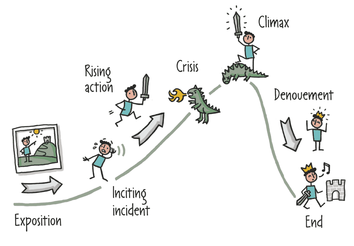
The Narrative Arc, from Donna Lichaw’s storymapping toolkit
Mapping the narrative arc to product development:
- Exposition: Who is the hero? What is their goal?
- Inciting incident: What is preventing them from accomplishing their goal?
- Rising action: What attempts have been made to solve that problem?
- Crisis: How have those attempts failed?
- Climax: What value does your product provide? What is its competitive advantage?
- Denouement: Hero uses your product
- End: Hero’s goal is met
Jason Lengstorf: How I Cut My Working Hours in Half and Somehow Managed to Get More Done
Jason is a designer and developer at IBM. It’s easy to roll your eyes at talks in the self-help/getting-things-done realm, but this one was really compelling and well-crafted. In 2012, Jason ran his own company and averaged 70 hours a week. His beard started falling out! He decided it was better to be poor and health than rich and sick, and he was ready to lose business if it meant he could get his life back. But his clients didn’t notice the difference, his business grew, and he actually started getting more done. (Slides available here.)
- Henry Ford discovered that working five days a week at eight hours per day was optimal for productivity. The error rate rises after that.
- Long hours destroy passion and engagement. You need time away to reflect on your work from a distance.
- Overworking increases employee turnover.
- Creativity suffers without perspective.
- Lack of downtime hurts productivity and creativity. Your subconscious brain works on problems when you step away.
- We lose 20 percent of our time per task while we’re multitasking
- Sleeping less than seven hours a night is worse than being too drunk to drive.
Five strategies to turbocharge productivity:
- Track your time. Acknowledging how we spend our time encourages us to use it more wisely. Don’t track it manually, find a way to automate it, with a tool like RescueTime, and track the changes.
- Time-box tasks. You’re never more productive than when you’re on deadline with 13 percent battery left. Find your rhythm (e.g. 90 minutes of work, 15 minute break). Turn off everything unrelated while in task mode. This works because:
- We’re not distracted.
- We get into a flow state.
- We’re taking breaks.
- We’re still available.
- Ultradian rhythm regulates our energy in approximate 90-minute intervals.
- Front-load important work. Motivation and self-control are resources that deplete as the day goes on. We’re the best versions of ourselves early in our day (whenever your day begins—not just the morning).
- Prioritize aggressively. There shouldn’t be a plural form of “priority.” If everything is important, nothing is. Try putting your to-do list in a tournament bracket.
- Do not multi-task. This is the most important one. Context-switching is fatal to productivity. Multi-tasking makes us feel more productive, but single-tasking makes us actually productive. Note the difference in difficulty parsing these two collections of information:
- 1 A I, 2 B II, 3 C III, 4 D IV, 5 E V, 6 F VI
- 1 2 3 4 5 6, A B C D E F, I II III IV V VI
Val Head: Choose Your Animation Adventure
Val is the author of Designing Interface Animation. She is a design advocate at Adobe specializing in UX/UI animation.
The world of web animation encompasses CSS, JavaScript, and SVG. Which technique is right for your animation task?
CSS
- Well-defined state transitions
- Looping and loaders
- Hover and focus
- Pros:
- No external library needed
- Great potential for performance without much effort
- Keyframes are reusable
- Properties can be adjusted in media queries
- Cons:
- Access to limited events
- Defined entirely ahead of time
- Transform properties can’t be separated
- Good for:
- Animated interactions with defined states
- Simple interactive animations
- No additional requests
- It might be time to move to JavaScript if:
- You’ll be chaining more than three animations in a sequence
- The animation needs to change dynamically at runtime
- You need to animate transform properties separately
- Physics or complex easing are necessary
JavaScript
- Complex animated interactions
- Narrative or immersive animation
- Dynamic state transitions
SVG
- Animated illustrations
- Animated icons
- Infographics / data visualizations
- Fluidly scaling, responsive animation
| SMIL 😕 | CSS 🙂 | JS 😀 |
|---|---|---|
|
|
|
Lottie
Lottie is an iOS, Android, and React Native library that renders After Effects animations in real time, allowing apps to use animations as easily as they use static images. Find examples at Lottie Files.
Wes Bos: What’s New in JavaScript?
Wes is a designer/developer who has made tons of tutorials to help people learn code. This JavaScript talk was mostly over my head, but hopefully its most salient details will remain lodged in my subconscious until the day I’m good enough with JS to make use of them.
Abby Covert: How to Make Sense of Any Mess
Abby works at Etsy and is the author of How to Make Sense of Any Mess, an information architecture manual written to be as broadly accessible as possible. “IA is not just for information architects. IA is practiced by everyone.” I unfortunately missed the beginning of her talk, so my notes are brief and have limited context.
We need pictures
- They give us something common to point to
- They take the time and space needed to colect and iterate
- They can visualize something hard to explain in words
- They can inspire realistic—not simplistic—thinking. But be careful of reductionism:
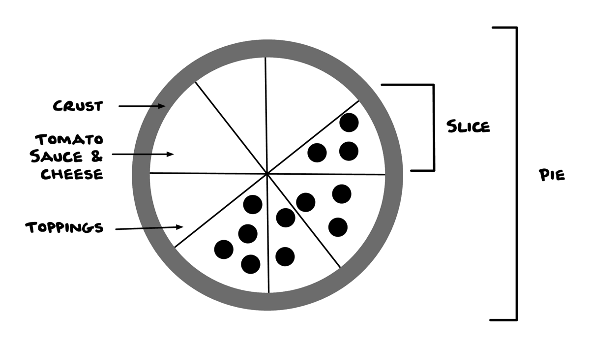
Beware of reductionism. If you didn’t know what pizza was, would you be able to make it from this schematic? Static mockups can be problematic in this way. Acknowledge complexity.
To start making sense of your mess:
- Talk about the language used in your organization
- Show an alternative way of organizing something
- Make a picture of the monster in everyone’s head
Brenda Storer: Using CSS Grid in the Real World
Brenda is a designer/developer at Thoughtbot. Her talk was a good overview of CSS Grid fundamentals. (Slides available here.)
- Identify a good use case.
- Flexbox is one-dimensional, grid is two-dimensional.
- When normally reaching for a layout property like Flexbox, floats, or positioning, consider Grid.
- Write Grid code.
- Fall back gracefully with feature queries.
- Grid code with a Flexbox fallback = ready for production!
- Some Grid syntax isn’t supported in Sass pre-V3.5
- Ship it!
Dan Mall: Should Designers…?
Dan is the founder and creative director of the design collaborative SuperFriendly. He is reliably generous with sharp design insights.
- What’s the one thing that makes the design special? The rest can be vanilla. You don’t need 20 innovations in one project.
- Not sure where to begin? Prioritize urgency:
- Fix what’s buggy and/or broken
- Work on heavily requested features
- Zero in on an idea you’re excited about
- Think about elements, not pages/screens. Create an element collage.
- Use a big canvas. Don’t constrain yourself at the outset (content-out, not canvas-in).
- Consider many sizes/orientations for each element.
- Keep it loose, have fun
Should designers code?Should designers learn a thing that makes them better? Yes. Will it be okay if they don’t? Yes. But should they? Yes. Start simple by teaching them about color and typography in CSS. Let them own those code elements on a project. From there, the three primary code-oriented tools they should get familiar with:- CSS: Once they have a handle on color and type, expand from there
- Web inspector: Easiest way to unpack others’ work, see how markup and styles work together, and understand what properties do
- JSON: A whole design system can be set up in a human-readable JSON file that a designer can tweak
- Design system: The smallest set of options that allow us to do everything we need.
- RACI Matrix: For each task in a project, each participant is either Responsible, Accountable, Consulted, or Informed:
| Strategist | Designer | Developer | |
|---|---|---|---|
| Customer experience | R | R | R |
| Interface design | C | R | A |
| Quality assurance | I | A | R |
| SEO-friendly markup | C | I | R |
| Icon style | C | R | I |
| Taxonomy | R | C | A |
| Motion design | I | R | A |
| Tone of voice | R | A | I |
Cynthia Savard Saucier: Tragic Design: The Impact of Bad Product Design
Cynthia is director of design at Shopify and co-author of Tragic Design.
- Recognize that design is a powerful tool (environmental, social political)
- Dark patterns trick users into doing something they don’t want to do.
- Betraying user trust is bad for business in the long term. (LinkedIn was fined $13 million for those obnoxious emails.)
- Don’t resign to turning to compromises
- Define your own ethical code: A list of compromises you won’t make, companies you won’t work for.
- Respect the user’s decision
- Your brain no longer knows the difference between Emoji and emotions
- Facebook’s limited Emoji reactions offer a narrow range of emotions
- It reduces empathy to a click
- Real faces and words have micro-expressions and can accommodate a spectrum of emotion
- Airbnb increased conversions by switching from hearts to stars
- Remember edge cases, the forgotten 10 percent. Facetime’s “call dropped” message doesn’t consider the possibility of a sad or stressful call.
- Your brain no longer knows the difference between Emoji and emotions
- Learn about emotions
- We can be analytical and empathetic but not at the same time
- Start with quantitative data, then move on to qualitative data
- Some buildings have two-tier alarm systems indicating emergency level, but there is no way to compare the two alarm sounds or know which is which
- Allergy injectors and other medical devices are operated in high-stress situations, sometimes by amateurs, but often aren’t designed intuitively with obvious affordances

Plutchik’s wheel of emotions illustrates the nuance of emotion.
- Write clear error messages
-
Test with different emotional states
- Introduce stress by enforcing a time limit
-
Ask “What’s the worst thing that could happen?”
- Could someone be hurt or killed?
- If you search for “suicide” on Tumblr, rather than immediately surfacing search results, it displays this message: “Everything okay? If you or someone you know is struggling with thoughts of suicide, the Lifeline is here to help: call 1–800–273–8255 […]”
- Be responsible for the work you put into the world
- Find your ring: Something to remind you of your responsibility to society
Henri Helvetica: Planet of the Apis: A Tale of Performance & User Experience
Henri is a performance-focused web developer. Like Wes’s talk, this one was kind of talking past a person like myself who isn’t adept at interacting with APIs, but it included some good reminders to keep an eye on resources like Internet World Stats to remember how differently the internet is experienced by people in developing countries.
Daniel Schutzsmith: How the Largest Human Rights Organization in the World Uses Design Systems to Win on the Web
Daniel is a digital technology manager / senior web developer for Amnesty International USA. He walked us through their recent redesign.
- Redesign goals:
- Responsive / mobile first: Website should load on all devices quickly and in the best layout for the device at hand. Images and content should be optimized for that device and load fast.
- Define a ladder of engagement: Simplify and guide the user experience along a path of engagement (make a donation, become a member, sign a petition, sign up for the newsletter, etc.)
- Create a visual language: Design and develop a common visual language that can be used to create new microsites, campaign sites, and other subdomains easily on the front and back end.
- Project management system was MOCHAI (similar to RACI): Manager, Owner, Consulted, Helper, Approver, Informed.
- Partnered with Hyperakt (founders Deroy and Julia are refugees from, respectively Cuba and Ukraine)
- Reasons for design system:
- Support the brand: Because we’re a global brand, we needed to look like we fit in with other countries’ branding but not the same. Also great for microsites.
- Naturally agile: All of the piece of the building blocks are available to use to make new solutions without sacrificing speed. Fits nicely into an agile workflow.
- Ease of use: Give familiarity to the visual and interactive objects provided for a user. Reinforced a recognizable pattern the user can rely on for minimal decision making.
- Atomic design, Bootstrap 4
- One system to rule them all:
- Amnesty brand guide: Big Yellow Book
- Hyperakt started with atoms, but the dev team was less granular
- Design and development collaborating using Sketch
- Reasons we moved to WordPress:
- Faith in maintenance: Plugins and core are regularly updated. Security updates are flawless. Drupal upgrades were cumbersome and often have breaking changes, even in Drupal 7 and 8.
- Easier development: We’ve experienced that smaller teams are able to get bigger problems solved faster with WordPress. Dev environments are easy with MigrateDBPro, etc…
- Robust community: An abundance of experts and vendors to work with. Support community always willing to help answer questions and explain solutions. WordCamps!
- WordPress starter theme: Sage
- WordPress advanced custom fields allowed for rapid prototyping of custom templates
- Future of the design system:
- Mobile app
- Public-facing style guide
- Desktop app
Amélie Lamont: Diversity Vs. Inclusion
Amélie is a product designer at Thoughtbot and co-founder of Good for POC. The bulk of her talk consisted of an icebreaker which I don’t think assisted all that much in making her point, but a lot of people really seemed to enjoy having the opportunity to come out of their shells a bit, so pay no attention to the beardy curmudgeon in the corner. Anyway, the main point, though essentially a semantic argument, had merit:
- Emphasizing diversity is more about visibility (think performative wokeness), whereas emphasizing inclusion is about actually empowering people.
- Equity is being free from judgment and bias (i.e. impossible).
- Privilege is about groups, not individuals. Being a white man doesn’t mean you don’t have problems, but it does mean you’re more likely to share in the benefits of institutional biases favoring white men.
- Google Image AI identifying black people as gorillas suggests black people weren’t involved in its development. Google is a diverse company, but maybe it could be more inclusive.
- “Do I feel empowered to ask someone to stop interrupting me in a meeting without getting fired?” We should aim to help people feel empowered to speak up.
Marisa Morby: Discover How Iterative Prototype Testing Will Help You Create a Winning Design, Every Time
Marisa is the head of research at Clearhead. I sadly missed the beginning of her talk, so my notes begin at her third point. What I did catch included a ton of great tips on how to conduct ongoing user research.
-
Create your questions
- What’s your user’s main goal?
- What are the top three things you want to learn from the interview?
- How long should the interview be?
- When user testing, try to falsify your idea, not validate it.
-
Interview tips:
- Keep it short and focused
- Make it simple
- Listen and ask followup questions
- Your job is to facilitate
-
Most important questions:
- “Tell me about the last time you did something similar.”
- “Show me how you would…”
- “What do you expect to happen if…”—Aim to meet expectations
-
Make sure you’re:
- Taking notes
- Getting permission to record
-
Walk away with:
- What was hard to do?
- What was easy?
- Past behavior predicts future behavior. Meet people where they are.
-
Think about:
- What similarities did you find among interviewees?
- What were the biggest problems?
- What did you do well?
- Repeat
-
Wrap it up. You’re done when:
- Main interactions run smoothly
- Positive feedback
- Users aren’t frustrated
- You’re not seeing consistent, similar errors
-
Prepare for the future
-
Passive research and data collection
- Helps keep a pulse on what’s happening
- Feedback from users
- Indentify changes to make
- Provides evidence to advocate for change
-
Collect research
- “What did you come here to do?”
- “Were you able to do it?”
- “How can we do better?”
- Research toolbox
-
Passive data collection
- Main funnel metrics
- Scroll depth
- Time on page
- Google Analytics
- Open Web Analytics
- Chartbeat
- Adobe Analytics
-
Passive research and data collection
-
Ship it
- Check your passive data collection every couple of weeks. Track trends for evidence of needs.
-
Aim for:
- A test-and-learn mindset
- Making changes people need
- Open the door for continual learning
- Testing with small groups isn’t statistically significant and can be anecdotal, but some research is better than no research.
Joseph Palumbo: What a Year in Comedy Taught Me About User Experience
Joseph is a customer success expert at Media Temple. He took a year off to try his hand at stand up comedy and was impressively studious about it. The main point was the fairly obvious “listen to your audience,” but he found lots of interesting (and entertaining) ways to unpack that.
- Comedy is a conversation. Listen to the audience.
- The root of “conversation” is “convert.” A conversation changes you.
- It doesn’t matter what you think is funny. What the audience laughs at is what matters.
- “I’m not funny, but I make the audience laugh.”
- Are you solving for the customer or for internal process?
- Customers only use/value five percent of your feature set. Find out what that is.
- The comedic continuum
- At one end is George Carlin: thoughtful, self-possessed.
- At the other end is Larry the Cable Guy: pandering.
- The audience is the spectrum between the two.
- Your first joke tells the audience who you are, and their response tells you who they are. That joke is a test; the rest of the set will be adjusted based on the results.
- Pick your audience or let them pick you? If the latter, write for yourself and see who pays attention.
- Keep it simple. You’re talking to drunk people. Are you simplifying your user’s lives?
- Failure is not an option. It’s mandatory. You have to write nine bad jokes for every one good one.
- “The difference between the almost right word and the right word is really a large matter—’tis the difference between the lightning-bug and the lightning.” —Mark Twain
- Tell a story, but use a framework.
- Don’t make the audience work for the laugh. People love to learn but hate to be taught.
- Frameworks offer success metrics.
- Give them a new take on something familiar. Never use the first punchline. Use the third. That one will be original.
- User interfaces are like jokes. They’re no good if you have to explain them.
Margot Bloomstein: Content Strategy for Slow Experiences
Margot is is the author of Content Strategy at Work.
- Content affects both our experience and our perception of the experience. Frustrating experiences feel slow, delightful experiences feel fast.
- Efficient isn’t always effective. Slow experiences aren’t inherently frustrating. Users can value slow, enduring experiences: engaged, anticipating, creating memories, focused.
- Why do this?
- Encourage exploration and discovery
- Drive more deliberate choices
- Help users focus
- Slow down users:
- Editorial style and structure support a shopping experience, not a buying experience.
- Discovery-oriented content types
- Longform content, visual and verbal
- Slow experiences take the time to empower users. Can we offer our users attention, respect, and time?
Jenn Schiffer: Art and Technology: Great, But Also Bad
Jenn is an artist, web developer, and engineer at Glitch. She talked primarily about how art and tech, ostensibly tools of democracy and inclusion, instead tend to reinforce existing power structures. The talk’s somewhat freeform structure made it tricky to take notes, but I did manage to extract a few gems.
- Consensual ephemerality: A good way to describe the permeanence or impermanence of various aspects of our digital lives being on our terms.
- The afterlives of network-based artworks: Due to the obsolescence of software programs, hardware and network infrastructures, many network-based artworks have disappeared. How can we give them an afterlife?
- Shop Art Theft: Support independent artists by purchasing their work, as (allegedly) stolen by major retailers.
- Computers aren’t smarter than humans, they’re faster.