Design Doesn’t Care What You Think Information Looks Like
Sometimes convention is sufficient. Sometimes it’s not.
Hello! My name is Rob Weychert. I’m an editorial experience designer at ProPublica, which means I work on the overall user experience of the ProPublica site as well as working on custom art direction and layout for some of our big feature stories.
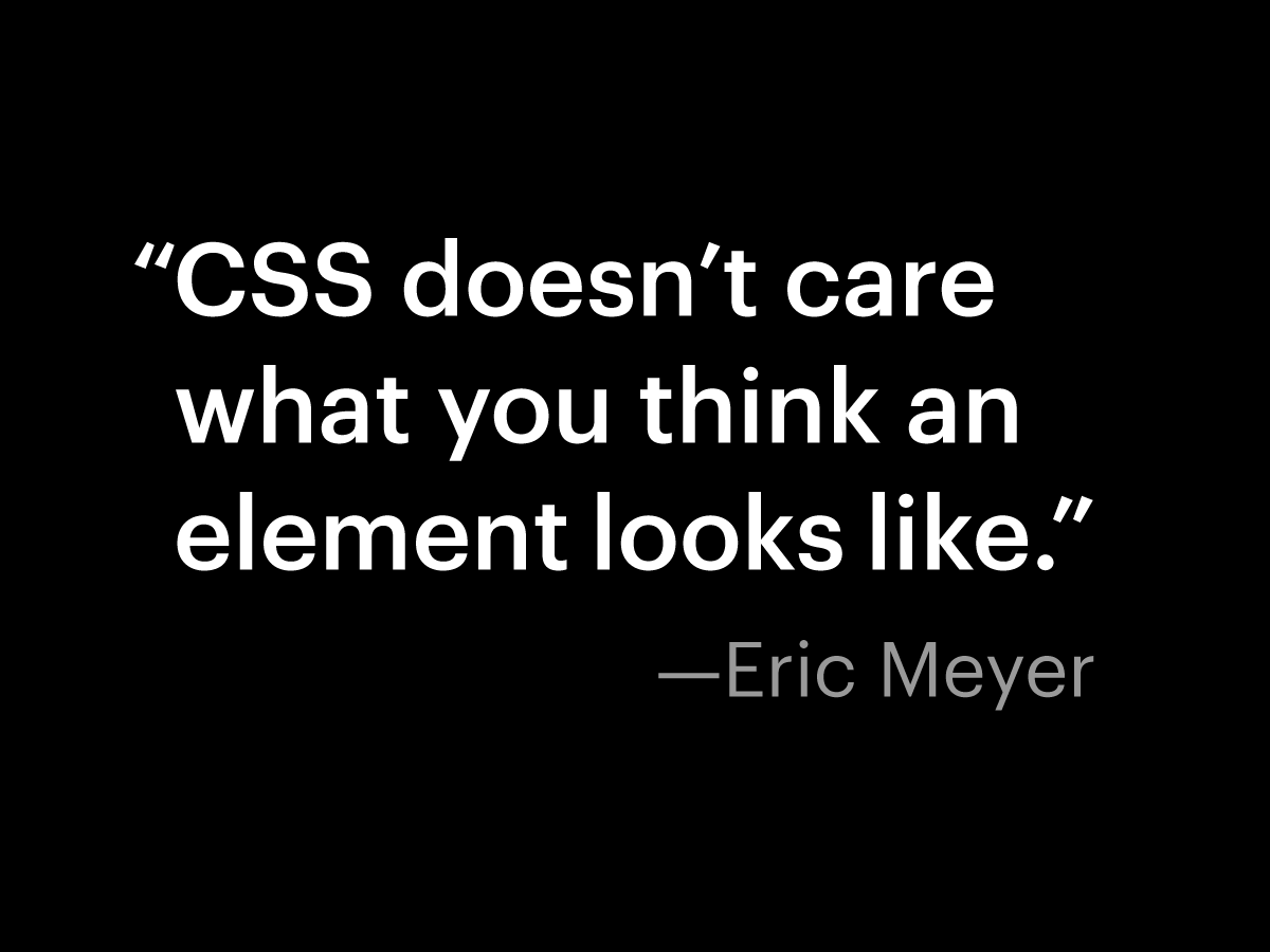
ProPublica is my first newsroom, but I’ve been designing websites for a long time, long enough to have had a good number of perspective-rattling epiphanies about what web design can be. The one I want to share today came in 2007 from Eric Meyer, who has been very influential in the world of CSS for pretty much as long as CSS has existed. I’ve learned a lot from Eric over the years, but the thing that sticks in my memory most is this:
If you don’t know much about CSS, the main thing to understand is that it’s used to style web pages, to specify their fonts, colors, layout, etc. So if, for example, we have a page that includes a table, but we haven’t specified any styles for it, the browser will probably make it look something like this by default:
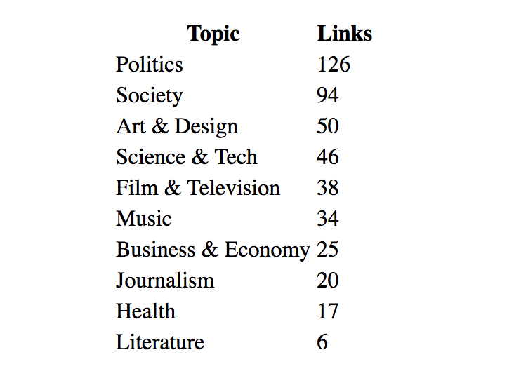
This particular table shows the most frequent topics of the links I shared on Twitter last year. If the browser’s vanilla table styles aren’t good enough for us—and they’re probably not—we can write some CSS to dress the table up a bit:
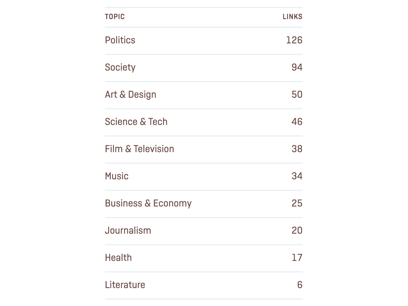
Hopefully we agree this is a big improvement, and it might even be good to go. It’s cleaner, more attractive, and easier to read. But let’s take a step back and ask what we want this table to do. It’s not merely a list of topics. The topics are shown in order of frequency, and the number of links per topic is shown for comparison. It works in its current state, but I think we can make it work even better.
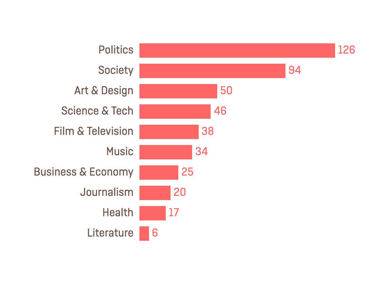
This is more like it, right? Suddenly this table is a lot more useful. Styling it as a bar chart makes it immediately clear just how significant those first two topics are. It takes advantage of visual design in a much more powerful way than our previous table design.
Now, styling tabular data as a bar chart isn’t uncommon. People generate charts from CSV files all the time.
But prior to hearing Eric say this, it simply didn’t occur to me that CSS could be used to make a table look like something other than a table. And whether we’re using CSS or some other design tool, I think most of us are susceptible to this kind of tunnel vision, assuming that the form of information is prescribed by what kind of information it is. We get used to the idea that “a table is a bunch of text arranged in rows and columns,” or, “a list is vertically stacked bits of text with bullet points in front of them.” These are definitely useful conventions, but we need to remember information can be visually interpreted in many ways. So I’m going to adjust Eric’s quote to make it a bit broader:
I want to show you this principle at work in a couple stories we’ve done at ProPublica, and share a few other lessons we picked up along the way as well.
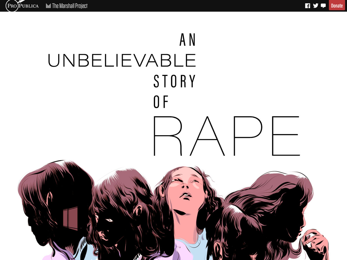
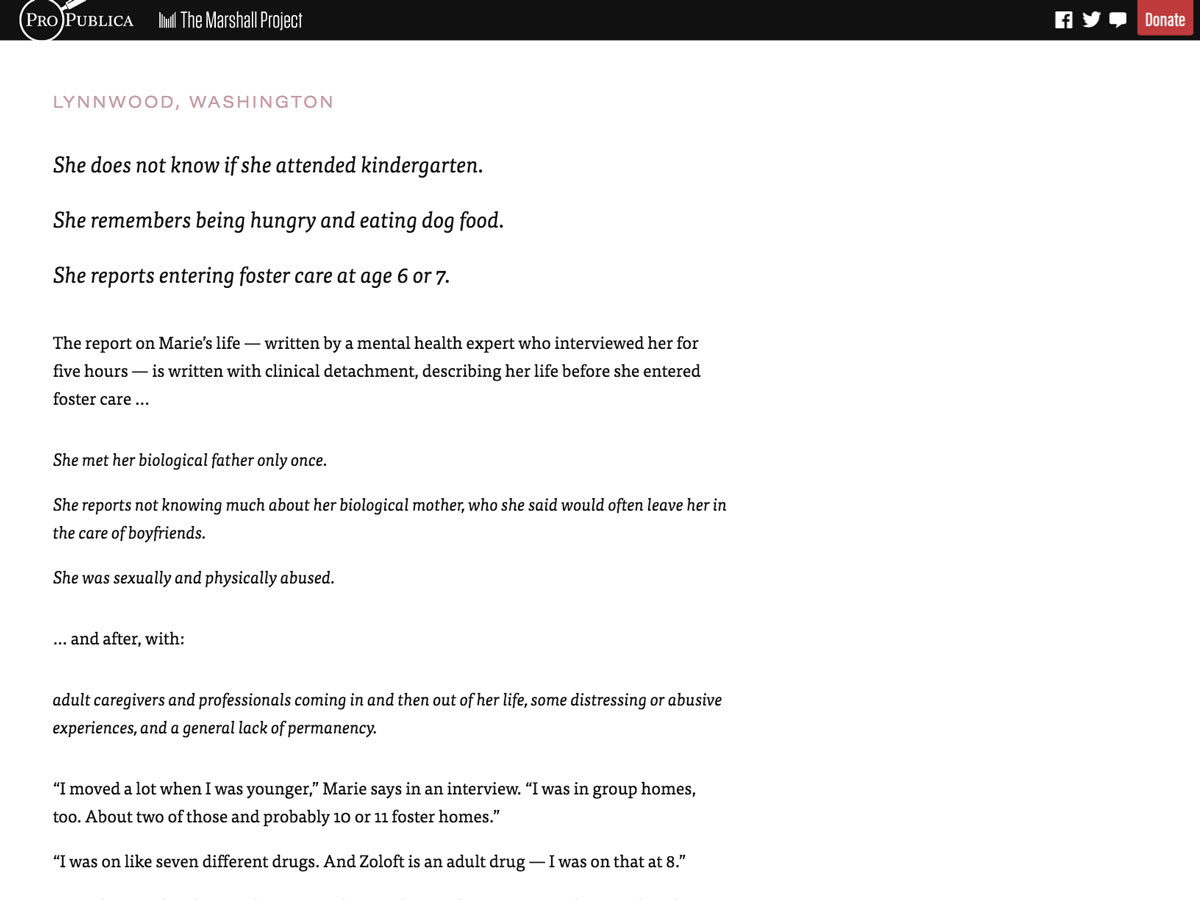
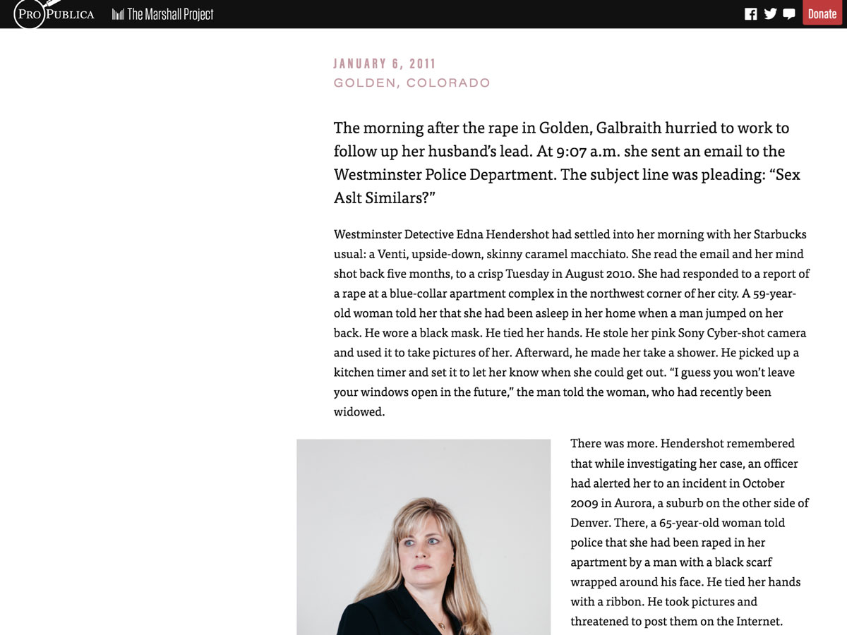
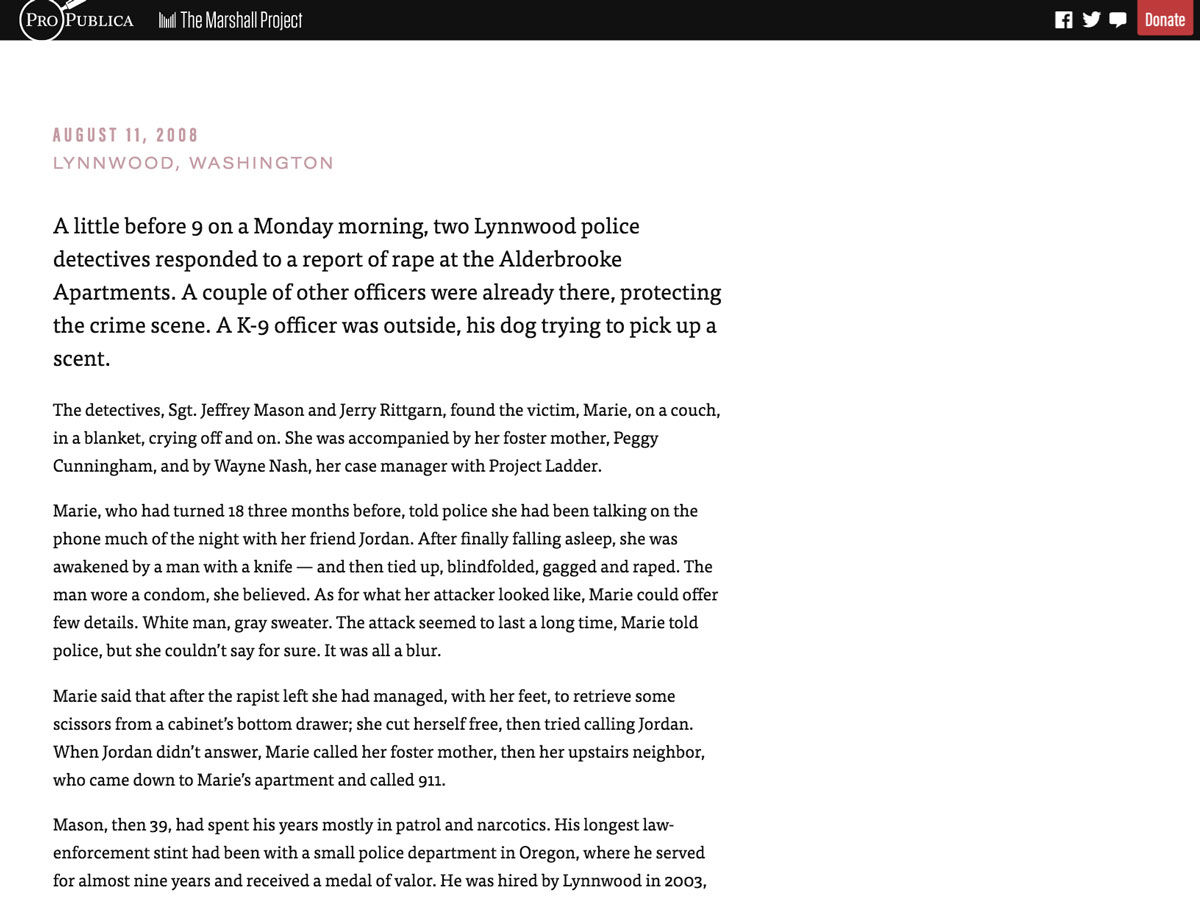
This is a story about a young rape victim whose ordeal actually got worse as a result of reporting it to the police. ProPublica’s reporter, T. Christian Miller, was months into his investigation when he crossed paths with another reporter, Ken Armstrong of The Marshall Project, who was working on the same story from a different angle. They decided to combine their efforts, and since the story involves a serial rapist who struck in multiple places over the course of several years, there were questions about how best to edit the story. Since T. primarily investigated the part that took place in Colorado, and Ken mainly focused on the part in Washington state, our design team advocated for the narrative to maintain that bifurcation. We could use design to visually punctuate the distance—of both time and place—between the crimes. You can see the bifurcation concept introduced in the headline, which juts left and right from a central axis.
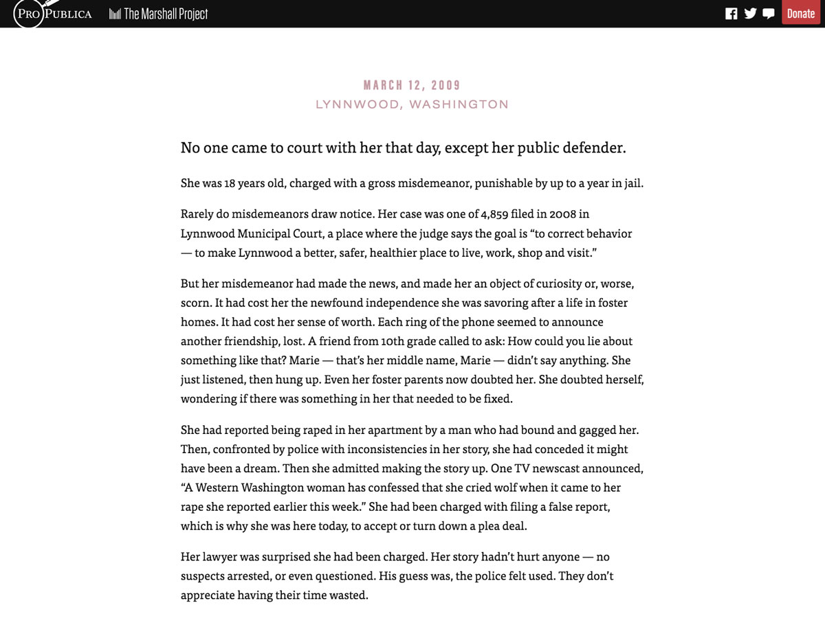
This story is 12,000 words long, and any lengthy text in web design is almost always a single, straight column. Deviations from that single column are rare, partly because it can be disruptive to the reading experience, partly because of technical limitations, and partly because we’ve learned to assume that’s just how it is. And our story layout begins in that expected fashion, with a column of text centered in the layout.
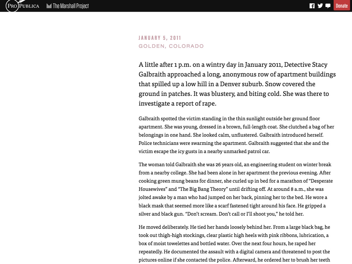
But once we get past the introduction and into the meat of the story, you’ll notice the layout shifts to the right.
And then the next section shifts all the way to the left.
Throughout the story, the text moves east and west between Colorado and Washington…
…until the two narrative threads finally converge and intertwine at the end:

It’s a dead simple minor deviation from a well-worn convention (the single text column) but it’s surprisingly effective.
Let’s look at another story whose concept and execution is a bit more complicated.
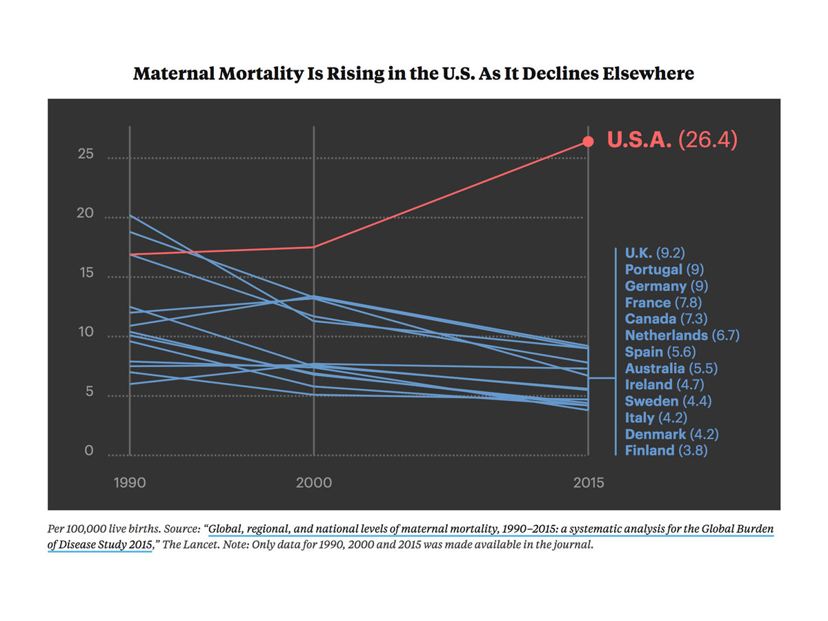
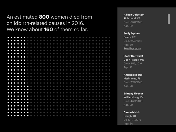
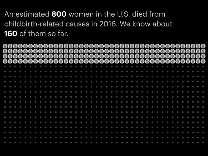
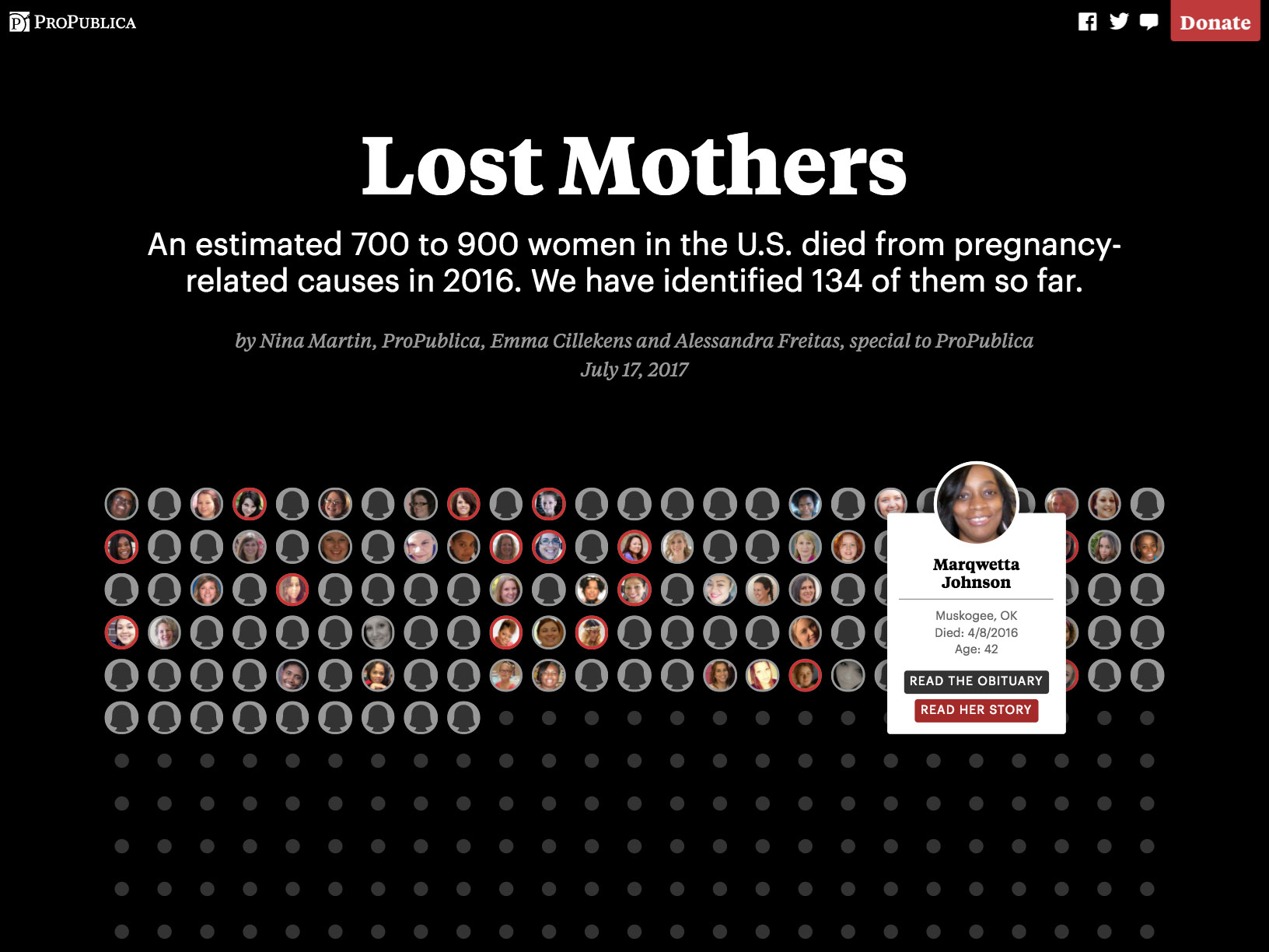
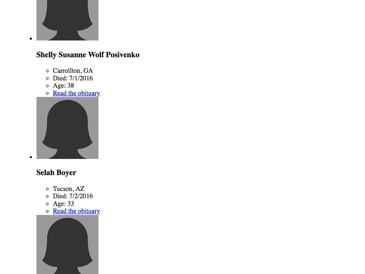
The U.S. has the worst rate of maternal deaths in the developed world, and as part of her extensive reporting on the subject, our reporter Nina Martin wanted to tell the stories of some of the affected women and their families, specifically women who died in 2016. The initial idea was to write a collection of vignettes about a handful of these women and create a gallery sidebar with basic information about the rest: photo, name, age, location, date of death, and a link to their obituary. But there were a couple problems with the gallery idea. For one thing, even understanding the terrible thing these women had in common, it was going to be a real challenge to make something engaging out of what was effectively a yearbook page of unfamiliar faces. And for another, while months of work by our dedicated research team was able to find details about well over 100 women, that was only a fraction of 2016’s estimated 700–900 maternal deaths in the U.S. So even if we wanted to do the yearbook page, it would be largely empty. And then we realized: that lack of data was itself a big part of the story. The absence of available information about the victims of this healthcare crisis doesn’t bode well for the problem being solved anytime soon.
So we changed up the approach in two significant ways:
- The gallery would be presented in such a way as to emphasize how much data simply wasn’t available.
- The gallery and the vignettes would be combined into one piece, so we could visually put the women whose stories we were telling into a broader context, show how many stories were yet to be told, and hopefully encourage other affected people to help us fill in that empty space with their stories.
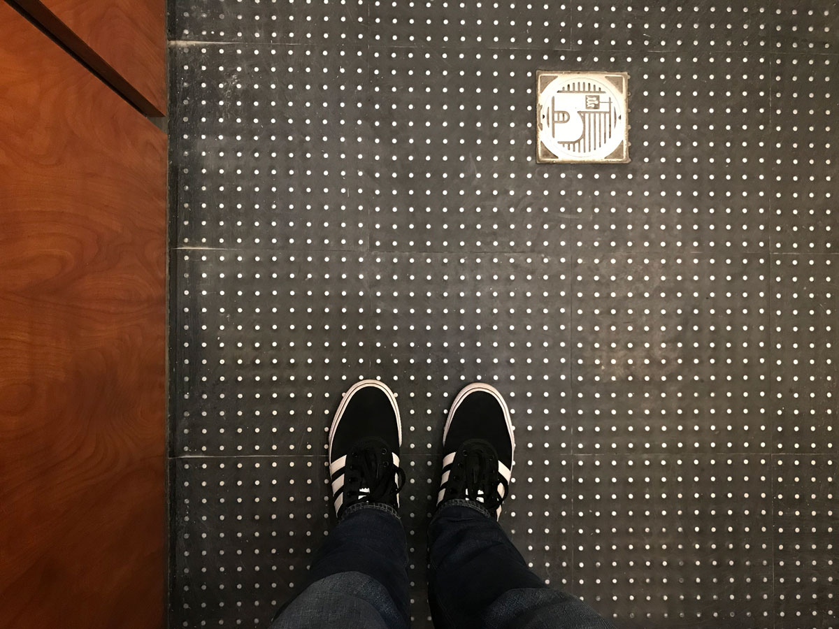
Our first iteration created a dot grid that showed the scope of the problem and how little information we were able to uncover, and off to the side was a scrolling list of the women represented. (Fun fact: the dot grid was partly inspired by the floor of the elevator in ProPublica’s building.)
This was a good start; the dot grid was a powerful visual, but the scrolling list wasn’t much of an improvement on the initial yearbook idea. So we said, “What if the list is incorporated into the grid, and the information about the women is revealed when you interact with it?” We mocked up a few possibilities. Would the dots themselves be enough?
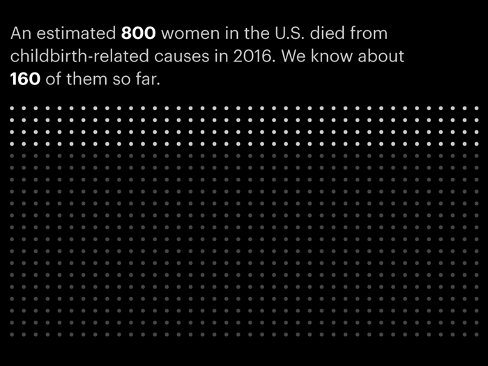
Probably not. It just looks like a static graphic; it’s not at all obvious that it’s interactive. So what if we hinted at the information inside each dot? Maybe a rotating animation that randomly surfaces names and photos associated with each dot?
We were starting to get somewhere. Maybe we actually had enough room to permanently surface the photos of the women?
As we got closer to what looked like the right solution, we built a prototype to flesh it out further and see how the interaction would feel.
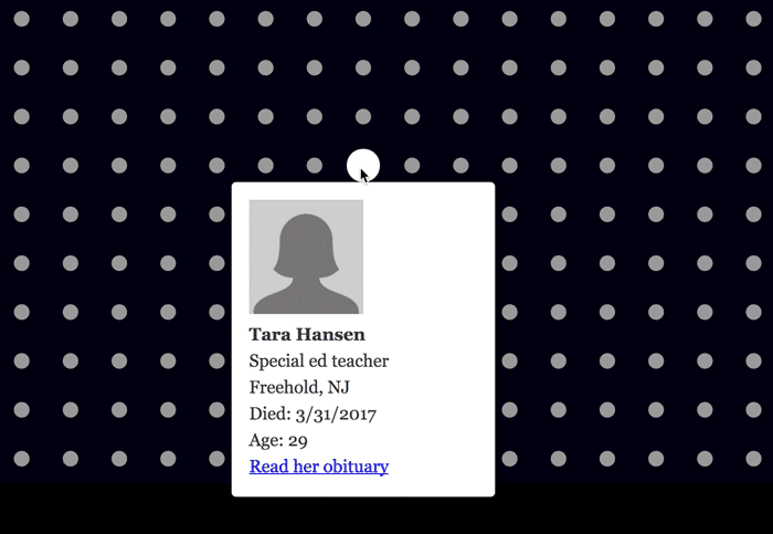
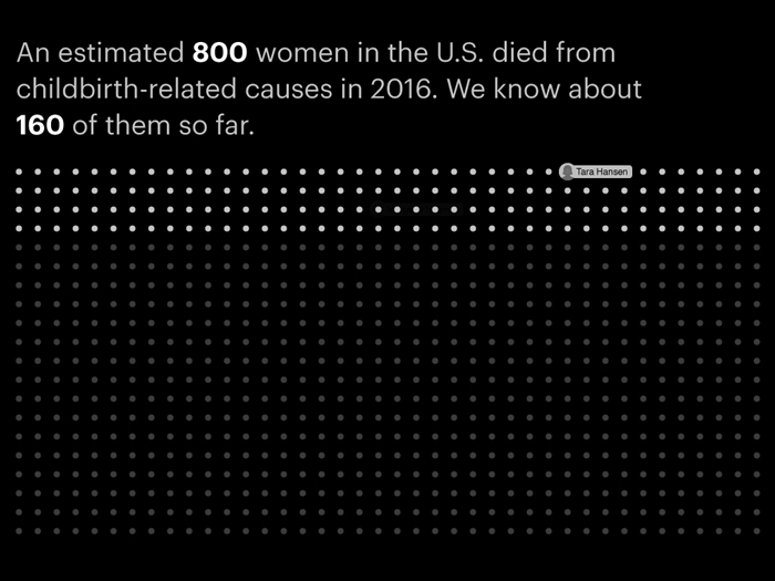
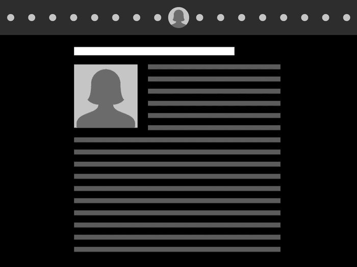
And since the women featured in the vignettes are represented in the grid as well, we hit on the idea that once the reader scrolled below the grid and started reading the vignettes, the grid could collapse into a horizontal bar at the top of the screen and show you where you currently are in the chronology.
The vignettes were specifically selected so that every month of 2016 was represented, which would keep the stories fairly evenly spread out across the grid. In the final piece, the grid entries with vignettes are outlined in red, which lets the user quickly identify the areas with the most in-depth info, and lets them navigate directly to the individual stories.
To recap, this dot grid is:
- A demonstration of the enormity of the problem of maternal mortality in the U.S. (800 dots)
- A demonstration of how little we know about the problem’s specifics (134 out of 800 dots)
- An interactive portal to information about 134 of the women affected by the problem
- Page navigation
And guess what? Under the hood, when we take away the styles, it’s just a regular old bullet list:
So remember:
Don’t get stuck on what different types of information are “supposed” to look like. They can take whatever shape you need them to.