Bridging the Type Divide: Classic Typography with CSS
A brief history of type
Like all the arts, [typography] is basically immune to progress, though it is not immune to change.
The art of typography has a rich and storied tradition, and like most art forms, its production processes have moved at a snail’s pace. After Gutenberg’s landmark invention of movable type (a printing method consisting of individual letters carved out of metal) in the fifteenth century, the technology of typography saw no significant change until the Industrial Revolution. The subsequent Linotype and Monotype machines and (the relatively short-lived) phototypesetting process were essentially faster, more efficient models of the same old printing method. However, the Macintosh’s introduction of type and design to the digital age in 1984 was the cultivation of a radical new method. Then, less than ten years later, just as graphic designers were becoming accustomed to digital production tools for print, a whole new medium was thrust upon them.
The World Wide Web was a revolutionary means to access information, and as such, it demanded a different way of thinking about design. However, with centuries of printed tradition behind them and a relatively recent adoption of the computer, most designers had a hard time thinking in terms of anything but print, and it didn’t help that HTML was never intended to accommodate graphic design. The other half of the Web was being designed by computer enthusiasts, professional and amateur alike. They had a better understanding of the exciting potential of the Web, but little or no knowledge of visual design principles.
So went the early, dark days of web design. Semantic, flexible documents looked anything but good, and good-looking documents were anything but semantic or flexible. Straddling the turn of the century, a greater emphasis on standardized web technologies aimed to solve this problem.
CSS gave designers the tools they needed to craft beautiful web pages without disrupting the underlying semantic structure of HTML. Previously unheard-of typographic control was now possible. But by this time, many designers had come of age online and were oblivious to the time-tested traditions and conventions of nuanced typographic design. Today, in the increasingly sophisticated infancy of the Web, much of its typography remains limp.
This chapter aims to help put a stop to this trend, by reconciling printed typography’s rich visual tradition with web typography’s exciting dynamic capabilities. I’ll demonstrate where they may converge, where they should agree to disagree, and how just a few simple and subtle typographic techniques can breathe new life into a page.
Know your text face
The number one complaint designers seem to have about setting type on the Web is the small number of typefaces reliably available across platforms. While this can be frustrating, it is important to remember that selecting a typeface is only one aspect of typographic design. Some of the best typographers in the print world limit their arsenal to only a few text faces that they come to know intimately through repeated study and usage. Even if the limited choice of typefaces appropriate for the Web does offer less variety, it forces that same good practice of restraint upon us. And luckily, a number of the faces available are among the very best examples of type designed for the screen. A keen understanding of these typefaces – including their creators and historical contexts – can be a great benefit to the way we use them.
Introducing Georgia
If you’re skeptical that a beautiful design can be achieved using one common typeface, it is my hope that this chapter will change your mind. The vast majority of what I’ll cover will use Georgia, a serif text face commissioned from renowned type designer Matthew Carter by Microsoft in 1993. According to recent results of an ongoing Code Style website survey, Georgia is present on about 91% of Macs, 84% of PCs, and 53% of Unix systems, making it one of the most ubiquitous serif typefaces in the world. Thankfully, it is also a stellar design.

Georgia is very similar to Times New Roman (Figure 7-1), one of the only serif faces with a wider distribution. Like Times New Roman, Georgia is a timeless design, embodying aesthetic and practical characteristics from a few different historical periods. However, for our purposes, Georgia trumps Times New Roman on the screen, since that’s where it was designed to be displayed.
The process

Typically, when a digital typeface is created, its printed form takes priority. Outlines of the type’s shapes are drawn first, and bitmap versions of small text sizes (for clarity on the screen, in case it should wind up there) are drawn based on those outlines. In other words, a resolution-independent design is retrofitted into an extremely low resolution. Results vary, but in many cases, small text sizes are all but illegible on the screen. With Georgia, Carter decided to reverse the process. Since this typeface was intended primarily for the screen, the bitmaps were drawn first (at 8- to 12-point sizes), and then the outlines were drawn to accommodate them (Figure 7-2). This resulted in an unprecedented elegant clarity for a screen-based serif face, a classification notorious for its illegibility.
The right man for the job
It was no fluke that Matthew Carter was chosen for the task. The son of an acclaimed type designer and printing historian, he began cutting original designs and revivals of classic typefaces in metal in the late 1950s, before going on to cofound the well-known Bitstream and Carter & Cone digital type foundries. Based on his decades of experience, impressive list of esteemed clients (including Time Magazine, The New York Times, and The Washington Post), and body of work (most notably Bell Centennial, and, later, the screen-based Verdana), few—if any—people could claim to be more qualified to design a timeless, legible typeface, intended for the screen but still rooted in tradition.
OK, now that you’ve got a handle on how, why, and when Georgia came about, you’re ready to put it to use, with a practical example. Let’s build something!
A page for Poe
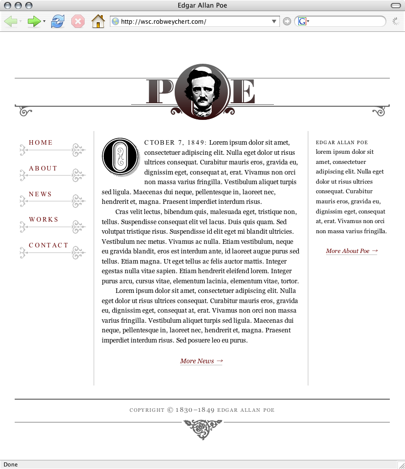
In order to demonstrate some possibilities, I’ve put together a little homepage for the original master of the macabre, Edgar Allan Poe (Figure 7-3). The basic layout is made up of four columns of approximately equal width. The two center columns compose the main content area, which is flanked by a navigation column on the left and a sidebar column on the right. The header and footer span the full width of the four columns.
Here is a simplified version of the markup:
<body>
  <!-- FULL PAGE WRAP -->
  <div id="wrap">
    <!-- NAV -->
    <ul id="nav">
      <li>Home</li>
      <li>About</li>
      <li>News</li>
      <li>Works</li>
      <li>Contact</li>
    </ul>
    <!-- MAIN CONTENT -->
    <div id="main">
      <p>Main content copy.</p>
    </div>
    <!-- ABOUT -->
    <div id="about">
      <p>About copy.</p>
    </div>
    <!-- FOOTER -->
    <h6 id="footer">Copyright information.</h6>
  </div>
</body>
This case study is available online for you to view at http://wsc.robweychert.com, and the source files are available to download from www.friendsofed.com. The page has been tested in the following browsers:
- Internet Explorer 6 and 7 for Windows
- Firefox 1.5 for Windows and Macintosh
- Opera 9 for Windows and Macintosh
- Safari 1.3 and 2.0 for Macintosh
A readable line length
The bulk of the techniques I’ll be discussing focus on the case study’s main content area (#main). This section will demonstrate how its proportions were devised and the effect those proportions have on the rest of the layout.
66: The number of the…
Since #main is the most important element in the hierarchy of the page, I want to be sure it carries the weight of a proper focal point and its readability is maximized. The first step is to determine the width of the line length. The standard range for a readable line of text set in a single column is between 45 and 75 characters (including spaces). This range allows lines to break in reasonable increments and prevents them from getting too long or too short for comfortable reading. Many typesetters revere an approximately 66-character line as ideal, and I am among them, so this example will use that width. This is a key proportion, and I want to make sure it is maintained as well as possible, which will be an important factor in how the page is put together.
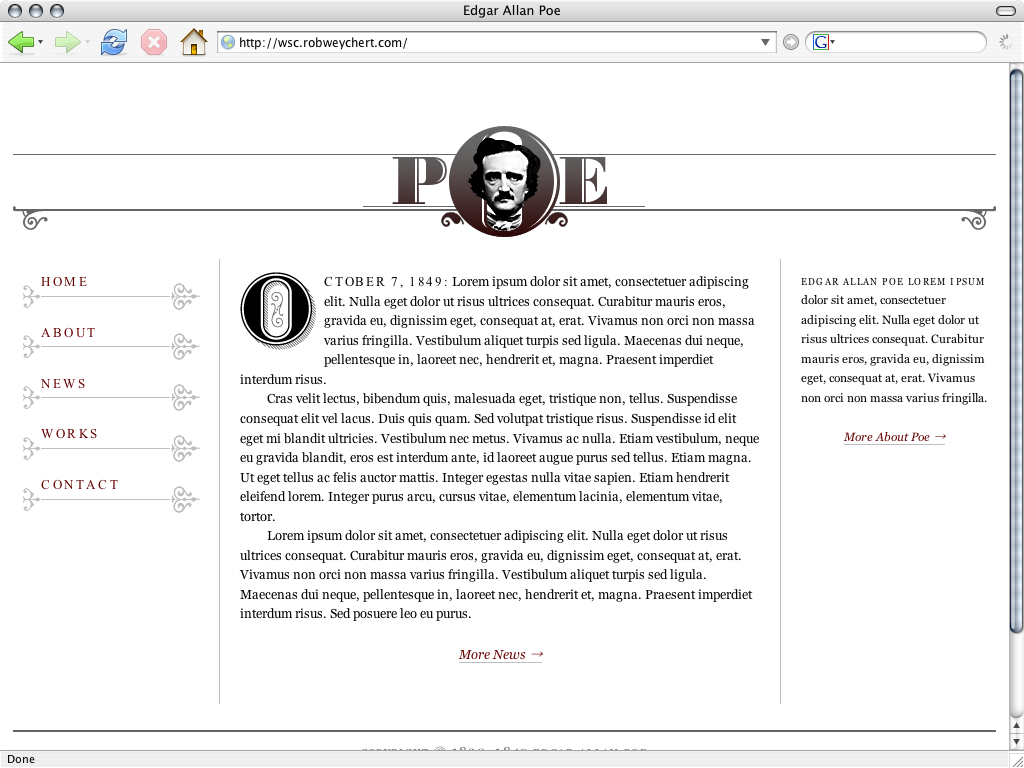
If I use a liquid layout, the line length will increase or decrease based on the width of the user’s browser window (Figure 7-4). On the other hand, if I use a fixed-width layout, the line length will increase or decrease if the user resizes the browser text, and the potential also exists for horizontal scrolling if the browser window is skinnier than my page’s specified width (Figure 7-5). Dissatisfied with both of these options, I’ve chosen instead to use an elastic layout, which gives me the best of both worlds (Figure 7-6).
The layout will expand and contract as the text is resized or as the browser is resized, but it will not expand beyond a specified width. The compromise here is that my line will get shorter as the browser window contracts, but a too-short line is easier to read than one that is too long, and is also a pleasant alternative to horizontal scrolling.


The almighty em

An elastic layout’s secret weapon is the em. In both the print and web worlds, an em is a square of a typeface size, based on either the width of its widest character or the distance from the bottom of its lowest descender (such as the stem of a lowercase p) to the top of its highest ascender (such as the stem of a lowercase b) or diacritical mark (Figure 7-7). In CSS, an em is based on the font-size of the parent element. Thus, if I specify the width of my layout in ems, it will expand and contract as the text is resized, maintaining the proportion between the text size and the length of the line, thereby keeping my 66-character line intact.

The elasticity of my layout will be suitable for most desktop browser resolutions, but I still want its intended proportions (Figure 7-8) to sit comfortably in an 800×600 browser window, so a native page width of 740px is prudent. In order to specify that width in ems, I’ll have to do some math.
My main content area (#main) needs to have a 66-character width, which also needs to be about 50% of the layout’s full width (#wrap). If I set a block of Georgia text with a width specified in ems, count the characters (including spaces) in a few lines, and divide the average of those lines by the width of the text block, I’ll discover that Georgia averages about 2.2 characters to an em. Therefore, a 66-character measure would be 30em, which would make #wrap 60em. If I divide 740px by 60, I get 12.3px, and voila! I have a font-size.
But there’s a problem. Internet Explorer will not resize text with a font-size specified in pixels. Luckily, modern browsers render font-size keywords pretty consistently, and I know that font-size: small resolves to about 13 pixels. With this figure and a little more math, I can achieve proportions well within the range of my desired results.

First, I’ll need to recalculate #wrap’s width, since it is based on my font-size, which is now a bit larger. If I divide 740px by 13px, #wrap’s new width (rounded up) is 57em. To maintain my 66-character line, #main’s width will remain 30em, which is 53% (again, rounded up) of #wrap’s width. Finally, accounting for 2% margins for each column will yield the proportions shown in Figure 7-9.
Translation
With smug simplicity, CSS concisely displays the proportions I worked so hard and verbosely to determine:
body {
  font-family: Georgia,"Times New Roman",Times,serif;
  font-size: small;
  }
#wrap {
  max-width: 57em;
  }
#nav {
  width: 19%;
  margin-right: 2%;
  }
#main {
  width: 53%;
  margin-left: 2%;
  margin-right: 2%;
  }
#about {
  width: 19%;
  margin-left: 2%;
  }
Figure 7-10 demonstrates the results: a very readable text block whose proportions will remain as consistent as can reasonably be expected. For another approach to using ems in CSS, see Mark Boulton’s Chapter 6.
#mainParagraph indents
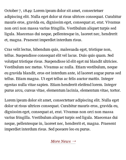
Now that #main has a nice, comfortable width, I’m going to turn my attention to the paragraphs within it. For as long as they have existed, web browsers have typically rendered paragraph elements with a default bottom margin, usually somewhere between 1em and 2em. This has the effect of a blank line between paragraphs, a custom that is certainly not unheard of in print. Just as likely to be seen in print, however, is a convention of delineation that is relatively rare on the Web: paragraph indents.
Where a blank line can sometimes be disruptive to continuous text, an indent on the first line of a paragraph can mark a new passage while maintaining the text’s cohesion. Still, it should be used with caution on the Web. Paragraph indents as an alternative to blank lines work well in print because of the other ways the text is physically broken up, such as multiple columns and pagination. Lengthy writing on the Web should likewise occasionally give the reader’s eyes the sort of relief a blank line can provide, and thus, paragraph indents on the Web are happiest in the company of brevity.
With just three short paragraphs to its name, #main is a perfect candidate for paragraph indents. There are just two things I need to do:
- Indent the first lines of all but the first paragraph.
- Get rid of those blank lines.
Simple indents
One extremely simple way to both indent my paragraphs and lose the blank lines without modifying my markup would be to do this:
p {
  text-indent: 2.1em;
  margin: 0;
  }
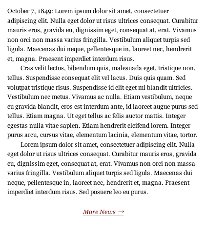
An indent of 2.1em carves a square out of my text block (Figure 7-11), which looks great. Unfortunately, though the results are otherwise perfect, this CSS rule indents my first paragraph. Just as using blank lines between paragraphs in addition to indents is a redundancy, so is indenting the first paragraph in the text. Two forms of delineation in tandem just belabor the point, like adding some big red text that says, “Behold, the birth of a new paragraph!” OK, maybe it’s not that bad, but I’d still prefer not to do it.
Adjacent selectors in an imperfect world
Using an adjacent selector is my logical next step:
p {
  margin: 0;
  }
p+p {
  text-indent: 2.1em;
  }
The p+p adjacent selector will address only a paragraph that is immediately preceded by another paragraph. In theory, this does exactly what I want it to, since the first paragraph is obviously not preceded by another paragraph, and will therefore ignore this rule. In a perfect world, this would have completed the task at hand, and I’d be at the bar by now. Sadly, though, Internet Explorer 6 does not support adjacent selectors, and now it renders all of my paragraphs as a single nebulous blob.
When faced with a similar problem while I was putting together my personal site, I solved it like so:
p {
  text-indent: 2.1;
  margin: 0;
  }
h2+p {
  text-indent: 0;
  }
The content area in question began with two headlines: a title (h1) and a date stamp (h2), followed by the first paragraph (p). The h2+p adjacent sibling selector achieved the desired effect in compliant browsers, and an indented first paragraph in Internet Explorer, a necessary compromise in a situation where the markup could not be altered.
This is not a viable option in my current situation, since #main’s first paragraph is not preceded by another element, but there is also nothing stopping me from altering the markup ever so slightly. I need only to give the first paragraph a class of first:
<p class="first">First paragraph copy goes here.</p>And then add one more rule to my original CSS:
p {
  text-indent: 2.1em;
  }
.first {
  text-indent: 0;
  }
Mission accomplished (Figure 7-12)!
This text block is shaping up nicely, but it still needs just a bit more. The last two ingredients of this typographic stew involve the creative use of capital letters, which will lend just enough visual interest to the page to complete the design.
Drop caps

Drop caps are one form of what is called a versal, a scribal tradition dating back to the earliest illuminated manuscripts of Europe’s medieval period (Figure 7-13). A versal’s purpose is to introduce the text with dignified fanfare. A drop cap does this by dramatically enlarging the first letter of the paragraph and carving out a space for it in the first few lines.
As another elegant piece of insurance that my readers will be immediately drawn to what #main has to say, a drop cap will suit this page well.
Here are the properties I want my drop cap to include:
- The body text should wrap around it.
- It should be about six times the size of the text.
- The top should be flush with the top of the first line of text.
- The left side should remain flush with the text’s left side, but the right and bottom sides should have a small margin to avoid butting up against the text.
Pseudo-elements in an imperfect world
Since I’m dealing directly with the first letter in my first paragraph (which already has a class of first), using the CSS :first-letter pseudo-element selector is a logical place to begin. Thus, rules for my drop cap will be addressed to p.first:first-line, and are easily translated line-for-line from my list of desired properties.
p.first:first-letter {
  float: left;
  font-size: 6em;
  line-height: .75em;
  margin-right: .1em;
  margin-bottom: .1em;
  }
In a rare twist, this code renders with reasonable consistency in all of my tested browsers, except for Firefox for Mac, which mysteriously inserts extra space at the top and bottom of my drop cap (Figure 7-14). No amount of fiddling with line-height, padding, or margin will make it behave consistently across browsers, and if the paragraph begins with an inline element like an em or strong (or a span, which I’ll be adding later), the results are even more disparate. Sadly, I’ll have to try a different solution.

:first-letter bugSpan to the rescue
Another small adjustment to the markup will be necessary. I wrap my O in a span (with a class of drop) like this:
<p class="first"><span class="drop">O</span>ctober 7, 1849...</p>And I give that class the exact same rules as before like this:
.drop {
  float: left;
  font-size: 6em;
  line-height: .75em;
  margin-right: .1em;
  margin-bottom: .1em;
  }
It works! My drop cap is in place (Figure 7-15).

Image replacement

But I’m still not happy. As much as I love Georgia, that big Georgia O is still not quite doing it for me. This page deserves something a bit more decorative, so I’ve created my own ornate capital O (Figure 7-16). This O is loosely based on the one found in Bodoni, an exquisite modern serif designed a year before Poe was born.
Rather than putting my versal image in the markup, I’m going to use an image replacement technique. Image replacement does exactly what it says: it replaces an element’s HTML text with an image. In this example, it will be accomplished by sucking the text out of the element with a negative text-indent, and then dropping in my versal graphic as a background image.
.drop {
  width: 83px;
  height: 83px;
  float: left;
  text-indent: -9999px;
  background-image: url(o.gif);
  background-repeat: no-repeat;
  background-position: top left;
  margin-right: .1em;
  margin-bottom: .1em;
  }
My float and margins are intact from the previous example, my text is negatively indented to another galaxy, and the values for width and height correspond to the width and height of my versal graphic. It looks great in all of the browsers I’m testing, except for Internet Explorer. That browser has chosen to negatively indent my entire paragraph instead of just my span, causing the paragraph to completely disappear (Figure 7-17).
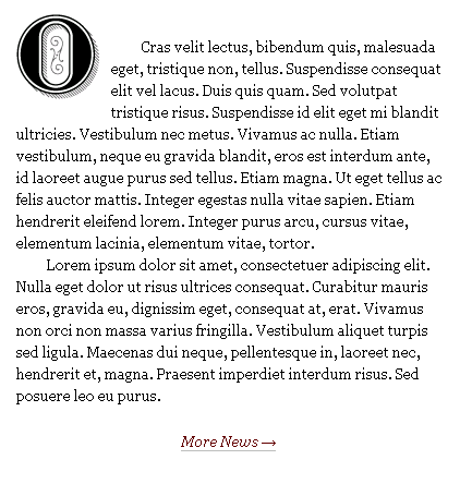
text-indent bugLuckily, this problem is cleared up by simply declaring the span to be a block-level element:
.drop {
  width: 83px;
  height: 83px;
  display: block;
  float: left;
  text-indent: -9999px;
  background-image: url(o.gif);
  background-repeat: no-repeat;
  background-position: top left;
  margin-right: .1em;
  margin-bottom: .1em;
  }
My custom-made drop cap is now in place (Figure 7-18)!
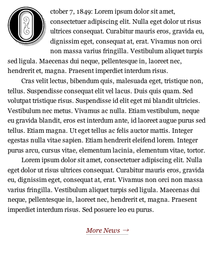
All caps
I am quite pleased with my drop cap. However, it is a bit visually jarring to have my paragraph go from such a bombastic introduction directly into much smaller lowercase text. I’ll address this issue with one last bit of refinement, after which #main will be ready to meet its public.
If you haven’t learned it in the typesetting world, you have probably learned it in the online world, especially in e-mail and instant messages: text set in all capital letters should be used with great caution. An errant mash of the Caps Lock key can give your audience members the impression that you are YELLING AT THEM, which isn’t the best way to keep them coming back. With this rule in mind, all caps can still be used to great effect, and a restrained usage will make a logical bridge between my gigantic drop cap and the much smaller body text that it introduces. Since my date stamp – October 7, 1849 (the date of Poe’s death) – already functions as a concise, self-contained opening to the text, it is a perfect candidate for the all caps treatment.
Your first instinct might be to merely set the text in all caps right in the markup, thereby avoiding the decidedly more laborious CSS process I am about to describe. This isn’t a good idea for a number of reasons, and chief among them is the possibility that you may later wish to style this text differently. If this were a template from which many pages were built, it would be a lot easier to change one rule in a CSS file than to change the markup in dozens (or hundreds, or thousands) of HTML documents. Also, as you’ll see in the following example, there can be quite a bit more to consider while setting all caps text than merely typing with Caps Lock on.
I’ll begin by adding one last span to my markup to target the date stamp:
<p class="first"><span class="datestamp">
<span class="drop">O</span>ctober 7, 1849:</span> Lorem ipsum...</p>
Now I just need two simple, self-explanatory CSS rules to make my datestamp class behave in the desired fashion:
.datestamp {
  text-transform: uppercase;
  letter-spacing: .13em;
  }
Giving text-transform a value of uppercase will ensure that my text is set in all caps. It can also take the values lowercase (for all lowercase text) and capitalize (to capitalize the first letter of each word). As for letter-spacing, when setting text in all caps, a bit of extra letter spacing is key for legibility. Through a small amount of experimentation, I came to find the very precise 0.13em measurement to be ideal for this case (Figure 7-19).

#main’s datestamp set in all caps GeorgiaMy paragraph introduction looks pretty good, but I’ve got one last fish to fry. One of the things that makes Georgia such a gem is that it is the only typeface in wide use on the Web that includes text figures (sometimes called old style figures) (Figure 7-20), which are essentially lowercase numerals. With ascenders and descenders just like lowercase letters, text figures are less disruptive to body text than their uppercase counterparts, called titling figures. Ideally, a typeface will include both text and titling figures, but typically only the latter is included. Georgia bears the odd distinction of instead including only text figures, and as a result, my uppercase date stamp has lowercase numerals. This won’t do.

Times New Roman, with its similarity to Georgia and inclusion of titling figures, is the perfect solution to this problem. In addition, I find Times New Roman set in all caps to be slightly less heavy and oppressive than Georgia set in all caps. Ordinarily, I would avoid using such similar typefaces in the same document, but it works quite well in this case, since the idea here is to create the illusion of one typeface. With one more simple CSS rule, #main will finally be complete (Figure 7-21):
.datestamp {
  font-family: "Times New Roman", Times, Georgia, serif;
  text-transform: uppercase;
  letter-spacing: .13em;
  }
#mainSmall caps
There is one more typographic element that I’ve chosen to address, to apply in the #about paragraph on the right side of Poe’s homepage. I want the first line to appear in small caps.
The basic markup of #about is very similar to #main.
<div id="about">
<p class="first">Edgar Allan Poe lorem ipsum...</p>
<p class="more"><a href="#" title="Edgar Allan Poe: About">More About Poe →</a></p>
</div>Small caps are capital letters that are usually slightly taller than their typeface’s x-height, which is the height of its lowercase letter x. Thus, they are effectively lowercase capital letters. They are commonly used for abbreviations, acronyms, and, as in this case study’s example, to mark the beginning of a text in a more subdued manner than a versal would. For this purpose, the first few words or the entire first line of an introductory paragraph might be set in small caps.
Fair warning

To the untrained eye, small caps can easily be mistaken for merely shrunken versions of their uppercase counterparts. However, in a well-designed typeface, small caps are drawn separately from the uppercase letters, and the subtle differences between the two maintain the consistency of the letters’ stroke weights (Figure 7-22). True small caps are easier to read at small point sizes and won’t disrupt the flow of the text, whereas faux small caps (for example, 8-point uppercase type set amid a block of otherwise 12-point type) are almost always conspicuous and distracting.
When faced with the following set of CSS rules, a web browser will set the specified text in Georgia Italic, which is of course a different design from – and not merely a slanted bastardization of – Georgia Regular.
font-family: Georgia;
font-style: italic;
However, if I were to add a rule of font-variant: small-caps, the text couldn’t be set in true small caps because Georgia has none to offer. Likewise, the vast majority of the most widely, publicly disseminated digital text faces do not include a set of small caps. As a result, web browsers use faux small caps by default. Before the dawn of screen font-smoothing technologies like Quartz (Mac OS) and ClearType (Windows), this wasn’t much of an issue, since the subtleties of faux small caps’ proportional differences were lost to the pixelated letters’ low resolution (Figure 7-23). With screen font-smoothing becoming increasingly prevalent, though, we can no longer rely on the browser to cover up its own typographic faux pas. Faux small caps now look more or less the same on the screen as they do in print.

Though faux small caps have been the object of legitimate scorn since long before the Web even existed, the argument could be made that they are acceptable on the Web, if only because true small caps simply aren’t available yet. Conspicuous though they may be, they still certainly have the power to enhance and enrich the page. The decision of whether or not to use them is yours to make.
More pseudo-element selectors in an imperfect world
My last attempt at using a pseudo-element selector ended in heartache (remember :first-letter?), but, for the sake of small caps, I’m going to try again, this time with :first-line. Unsurprisingly, :first-line affects its targeted element’s first line of text. In this case, the targeted element will be #about’s first paragraph.
#about p.first:first-line {
  font-variant: small-caps;
  text-transform: lowercase;
  letter-spacing: .1em;
  }
By now, these CSS rules should be fairly elementary, but there is one line that may have raised a questioning eyebrow. Why did I use text-transform: lowercase? The reasons are both preferential and practical. Small caps can, by their nature, function as either uppercase or lowercase letters. Accordingly, words that would ordinarily require capitalization (such as proper names) may or may not begin with a full capital letter when set in small caps. I usually prefer not to capitalize words set in small caps as a matter of consistency, since acronyms typically use small caps in place of the full caps that otherwise construct them. As for the practical concern, I don’t want any more attention drawn to the artificiality of my faux small caps than is necessary. To have them sit alongside full caps invites comparison and further exposes their inauthenticity (as seen in Figure 7-23), so I prefer to keep them among their own faux kind if I can.
This may be sound reasoning, but Internet Explorer and Safari will hear none of it. Each has its own bug that prevents the intended effect from happening. Internet Explorer will not acknowledge any combination of font-variant and text-transform rules, and Safari will not acknowledge a text-transform rule applied to a pseudo-element selector. As a result, Internet Explorer and Safari both render the markup’s capital letters as full caps. Firefox and Opera display the text correctly.
The Safari bug in particular makes it impossible for my intended effect to render consistently across browsers, as it’s a combination of the pseudo-element selector first-line and the text-transform: lowercase rule that I’m trying to use here. Therefore, avoiding further changes to my markup and ensuring that my small caps remain only on the first line of text will require a compromise: Internet Explorer and Safari will display a potentially mixed bag of full caps and faux small caps. Looking at the finished page (Figure 7-24), I think I could definitely do a lot worse!

Conclusion
Make no mistake: the print world and the web world are different places, each with its own idiosyncrasies. They do have at least one very important thing in common, though, which is that they exist to help people communicate. While we should acknowledge and respect the fact that what works typographically for one might not work for the other, we should also respect the reader, who can benefit from many techniques whose utility is not inextricably tied to either medium. The techniques I’ve outlined in this chapter should have given you a good idea of some ways that you can enliven type on the Web.