Designing Better Concert Listings
How to make it easier for music fans to find shows.
I’m an avid consumer of live music, and New York City offers a ton of concert options on any given night, so I spend a lot of time poring over listings to make sure I don’t miss anything good. One of the primary ways I find out about shows is email marketing; I probably average about two dozen emails each week from various venues and promoters. And I can’t help wondering how much easier it would be to stay up to date if those emails were designed a little better.
Now, I’m not a marketing pro, and I don’t doubt that these email templates were carefully and intentionally crafted and tested to serve a variety of audiences. But I’m part of one of those audiences, and I find some of the designs routinely frustrating. So I thought it would be a worthwhile exercise to think about what I and other concert goers might need from these listings, examine the successes and failures of the existing designs, and propose some improvements.
First, let’s take a look at the general structure of these emails. Most of them follow a formula something like this:
- Just Announced: a short text list or grid of shows that weren’t included in previous emails
- Featured: upcoming shows of note, often arranged in a grid with large images of the artists for extra visual emphasis
- Upcoming: a long text list of all other upcoming shows
The Just Announced and Featured sections usually do their job well enough, partly because they have few enough listings that their content is fairly easily read regardless of its design. The problems arise in the Upcoming section, where the bulk of the content lives. This section needs to be about one thing: scanning. There are typically dozens of shows listed here, and many—if not most—won’t be relevant to the viewer. The design’s job is to help them efficiently find the ones that are relevant, and skip over the rest. There are several different categories of information a prospective concert goer might be scanning for:
- Artist image: “These people look like they know how to put on a show.”
- Artist name: “Oh, I like them!”
- Date: “I have some free evenings the week of the 11th.”
- Day of the week: “Let’s see what the weekends have in store.”
- Genre: “It’s been awhile since I’ve been to a good jazz show.”
- Ticket price: “I’m not picky, I’m just looking for cheap live music.”
- Venue: “I love that room; the sound is amazing there.”
With all this in mind, let’s look at how some of these lists of upcoming shows can fall short.
The blob
The most unfortunate Upcoming list I’ve seen is from Boom Collective. It is a largely unadorned blob of hyperlinks.
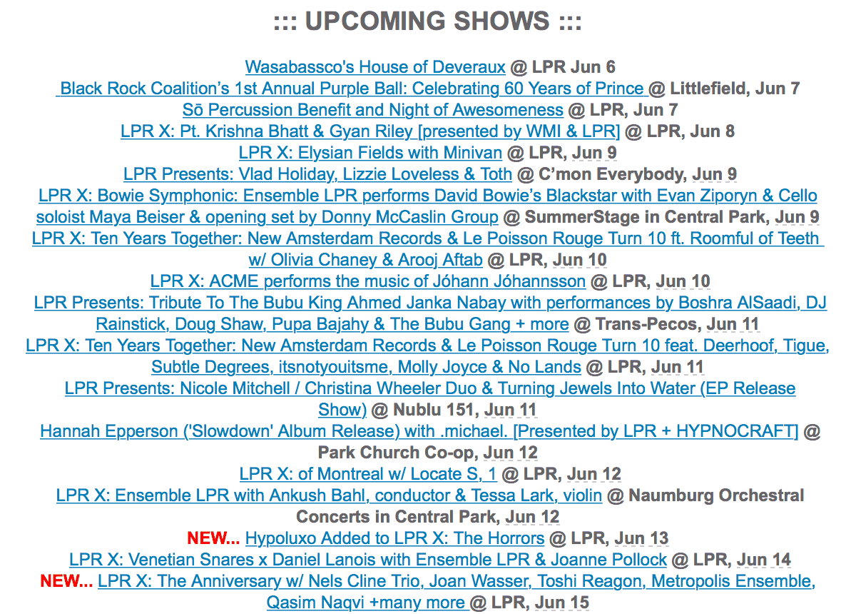
An excerpt of Boom Collective’s list of upcoming shows. This is only a third of the list! See the full screenshot.
This is an incredibly uninviting design, and any poor soul who is desperate enough to read or scan through it will find it fatiguing. Since the text is centered, each line begins in a different place, which makes the eye do extra work to find each listing, and that difficulty is compounded by the tight line spacing. And even though it contains a bare minimum of information (less than half of the scanning categories mentioned above), the list is visually overwhelming, with no hierarchy and plenty of cruft (any text beginning with “Presented by” is of use to no one but the presenter). Among this email’s recipients, I think I’m a more motivated reader than most, and this list repels me every time. I won’t even attempt to look through it, which probably means I’m missing out on some good shows.
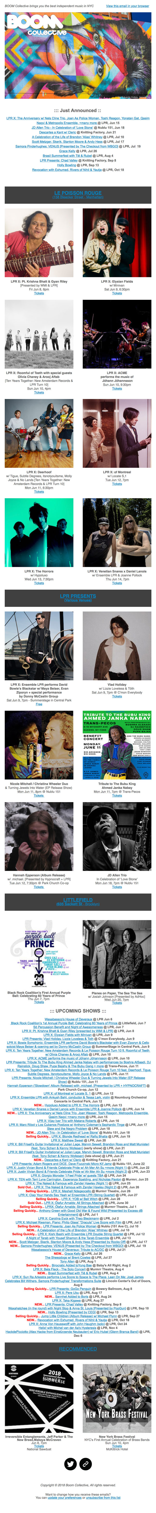
Le Poisson Rouge improves on the blob concept slightly by introducing more generous line-spacing and adding more distinct delineation between date, artist, and venue. But this is still an ill-advised approach.
Le Poisson Rouge’s list of upcoming events. See the full screenshot.
The table
Look at what a huge difference just a little bit of organization can make! For information intended to be scanned across multiple categories, a table can’t be beat.

The Bowery Ballroom’s list of upcoming shows uses a simple table. See the full screenshot.
This one uses two columns for three categories: day of the week and date in the left column, and artist(s) in the right column, with headliners distinguished from supporting acts. This is a much more scannable list than the previous examples, but it would be nice if it could accommodate some additional categories of information.
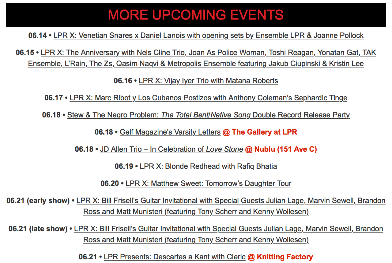
Elsewhere in the same Bowery Ballroom email, a table for featured shows offers considerably more detail—too much, I’d argue:
The Bowery Ballroom’s list of featured shows.
For one thing, these are all Bowery Ballroom shows, so the venue can be safely omitted from individual listings. For another, it’s commonly understood that the vast majority of shows take place at night, so the doors and show times can probably wait until the viewer clicks through to the event page.
There’s a couple of visual issues worth pointing out here as well. Setting the headliners in large, all-caps type is a nice way to emphasize them, and color can bolster that. But the red used here has significantly lower luminance than the default white text, decreasing the headliners’ contrast and undermining the emphasis. Also, while the introduction of artist images is a nice touch for folks who are more visual than verbal, the images’ unpredictable sizes are arguably disruptive to scanning.
Otherwise, this design is pretty close! It includes nearly every category I listed above in a reasonably scannable form. A little finesse with typography, spacing, and placement will take it across the finish line.
My proposal
I put together a quick grayscale mockup. To bring everything full circle, its content comes from the very first example, the Boom Collective blob.
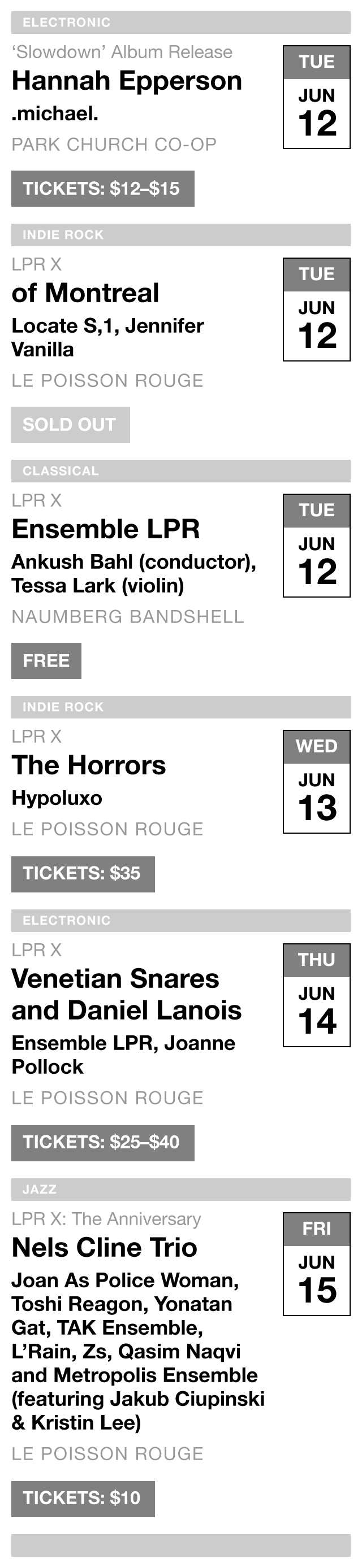
Proposal for small screens.
Proposal for large screens.
Each of the scanning categories is present and has a distinct visual style and placement. The result may initially be disconcerting to designers accustomed to thinking in terms of the gestalt: the listings have no obvious focal point, and several elements seem to be fighting for dominance. But rather than this being a case of “if everything is important, nothing is,” it allows the viewer to easily detect patterns, isolate what’s most important to them, and ignore the rest until they’re ready for additional information.
- Artist images occupy their own column on the left side (though they’re sacrificed on smaller screens) and share a uniform square crop.
- Artist names are bold, front and center. Headliners are extra large, and if additional context for the event is relevant (title, series name), it gets a subdued supporting placement above.
- Dates and days of the week take a shape familiar to anyone who’s ever used a calendar, and they have the right column all to themselves. In addition to specifying when individual shows are happening, they orient the viewer within the larger chronology of the list; if they’re looking for a particular date, this quickly gives them a sense of their proximity to it.
- Genres appear in simple stripes at the top of the listings, which double as borders between shows. Of course, genre is the least concrete category and an inherently messy concept. Classifications are bound to be controversial, but I think an inevitably imperfect implementation is better than nothing.
- Ticket prices are displayed as buttons, inviting you to buy. For a sold out show, the button is disabled and omits the price, which is no longer relevant.
- Venues hang back a bit, but their all-caps treatment makes it easy to spot them in the crowd. If all listings are for the same venue, it can easily be omitted.
The design is restrained with sensitivity to the limitations of CSS support in email clients, and even within those constraints, more could be done here. This also hasn’t been user-tested. But as an exercise, I think it makes my point. More thoughtful design of listings like these is a benefit to everyone: the easier it is for fans to find shows they want to attend, the faster the tickets get sold.